12 Transportation
Prerequisites
- This chapter uses the following packages:73
12.1 Introduction
In few other sectors is geographic space more tangible than transport. The effort of moving (overcoming distance) is central to the ‘first law’ of geography, defined by Waldo Tobler in 1970 as follows (Miller 2004):
Everything is related to everything else, but near things are more related than distant things.
This ‘law’ is the basis for spatial autocorrelation and other key geographic concepts. It applies to phenomena as diverse as friendship networks and ecological diversity and can be explained by the costs of transport — in terms of time, energy and money — which constitute the ‘friction of distance.’ From this perspective, transport technologies are disruptive, changing geographic relationships between geographic entities including mobile humans and goods: “the purpose of transportation is to overcome space” (Rodrigue, Comtois, and Slack 2013).
Transport is an inherently geospatial activity. It involves traversing continuous geographic space between A and B, and infinite localities in between. It is therefore unsurprising that transport researchers have long turned to geocomputational methods to understand movement patterns and that transport problems are a motivator of geocomputational methods.
This chapter introduces the geographic analysis of transport systems at different geographic levels, including:
- Areal units: transport patterns can be understood with reference to zonal aggregates such as the main mode of travel (by car, bike or foot, for example) and average distance of trips made by people living in a particular zone, covered in Section 12.3.
- Desire lines: straight lines that represent ‘origin-destination’ data that records how many people travel (or could travel) between places (points or zones) in geographic space, the topic of Section 12.4.
- Routes: these are lines representing a path along the route network along the desire lines defined in the previous bullet point. We will see how to create them in Section 12.5.
- Nodes: these are points in the transport system that can represent common origins and destinations and public transport stations such as bus stops and rail stations, the topic of Section 12.6.
- Route networks: these represent the system of roads, paths and other linear features in an area and are covered in Section 12.7. They can be represented as geographic features (representing route segments) or structured as an interconnected graph, with the level of traffic on different segments referred to as ‘flow’ by transport modelers (Hollander 2016).
Another key level is agents, mobile entities like you and me. These can be represented computationally thanks to software such as MATSim, which captures the dynamics of transport systems using an agent-based modeling (ABM) approach at high spatial and temporal resolution (Horni, Nagel, and Axhausen 2016). ABM is a powerful approach to transport research with great potential for integration with R’s spatial classes (Thiele 2014; Lovelace and Dumont 2016), but is outside the scope of this chapter. Beyond geographic levels and agents, the basic unit of analysis in most transport models is the trip, a single purpose journey from an origin ‘A’ to a destination ‘B’ (Hollander 2016). Trips join-up the different levels of transport systems: they are usually represented as desire lines connecting zone centroids (nodes), they can be allocated onto the route network as routes, and are made by people who can be represented as agents.
Transport systems are dynamic systems adding additional complexity. The purpose of geographic transport modeling can be interpreted as simplifying this complexity in a way that captures the essence of transport problems. Selecting an appropriate level of geographic analysis can help simplify this complexity, to capture the essence of a transport system without losing its most important features and variables (Hollander 2016).
Typically, models are designed to solve a particular problem. For this reason, this chapter is based around a policy scenario, introduced in the next section, that asks: how to increase cycling in the city of Bristol? Chapter 13 demonstrates another application of geocomputation: prioritising the location of new bike shops. There is a link between the chapters because bike shops may benefit from new cycling infrastructure, demonstrating an important feature of transport systems: they are closely linked to broader social, economic and land-use patterns.
12.2 A case study of Bristol
The case study used for this chapter is located in Bristol, a city in the west of England, around 30 km east of the Welsh capital Cardiff. An overview of the region’s transport network is illustrated in Figure 12.1, which shows a diversity of transport infrastructure, for cycling, public transport, and private motor vehicles.
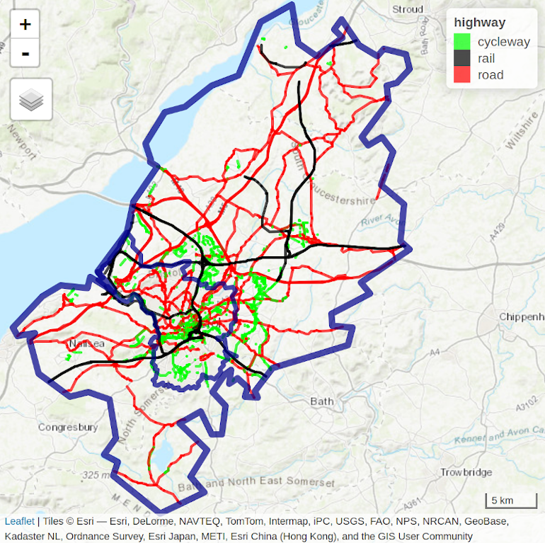
FIGURE 12.1: Bristol’s transport network represented by colored lines for active (green), public (railways, black) and private motor (red) modes of travel. Blue border lines represent the inner city boundary and the larger Travel To Work Area (TTWA).
Bristol is the 10th largest city council in England, with a population of half a million people, although its travel catchment area is larger (see Section 12.3). It has a vibrant economy with aerospace, media, financial service and tourism companies, alongside two major universities. Bristol shows a high average income per capita but also contains areas of severe deprivation (Bristol City Council 2015).
In terms of transport, Bristol is well served by rail and road links, and has a relatively high level of active travel. 19% of its citizens cycle and 88% walk at least once per month according to the Active People Survey (the national average is 15% and 81%, respectively). 8% of the population said they cycled to work in the 2011 census, compared with only 3% nationwide.
Despite impressive walking and cycling statistics, the city has a major congestion problem. Part of the solution is to continue to increase the proportion of trips made by cycling. Cycling has a greater potential to replace car trips than walking because of the speed of this mode, around 3-4 times faster than walking (with typical speeds of 15-20 km/h vs 4-6 km/h for walking). There is an ambitious plan to double the share of cycling by 2020.
In this policy context, the aim of this chapter, beyond demonstrating how geocomputation with R can be used to support sustainable transport planning, is to provide evidence for decision-makers in Bristol to decide how best to increase the share of walking and cycling in particular in the city. This high-level aim will be met via the following objectives:
- Describe the geographical pattern of transport behavior in the city
- Identify key public transport nodes and routes along which cycling to rail stations could be encouraged, as the first stage in multi-model trips
- Analyze travel ‘desire lines’, to find where many people drive short distances
- Identify cycle route locations that will encourage less car driving and more cycling
To get the wheels rolling on the practical aspects of this chapter, we begin by loading zonal data on travel patterns. These zone-level data are small but often vital for gaining a basic understanding of a settlement’s overall transport system.
12.3 Transport zones
Although transport systems are primarily based on linear features and nodes — including pathways and stations — it often makes sense to start with areal data, to break continuous space into tangible units (Hollander 2016). In addition to the boundary defining the study area (Bristol in this case), two zone types are of particular interest to transport researchers: origin and destination zones. Often, the same geographic units are used for origins and destinations. However, different zoning systems, such as ‘Workplace Zones,’ may be appropriate to represent the increased density of trip destinations in areas with many ‘trip attractors’ such as schools and shops (Office for National Statistics 2014).
The simplest way to define a study area is often the first matching boundary returned by OpenStreetMap, which can be obtained using osmdata with a command such as bristol_region = osmdata::getbb("Bristol", format_out = "sf_polygon"). This results in an sf object representing the bounds of the largest matching city region, either a rectangular polygon of the bounding box or a detailed polygonal boundary.74
For Bristol, UK, a detailed polygon is returned, representing the official boundary of Bristol (see the inner blue boundary in Figure 12.1) but there are a couple of issues with this approach:
- The first OSM boundary returned by OSM may not be the official boundary used by local authorities
- Even if OSM returns the official boundary, this may be inappropriate for transport research because they bear little relation to where people travel
Travel to Work Areas (TTWAs) address these issues by creating a zoning system analogous to hydrological watersheds.
TTWAs were first defined as contiguous zones within which 75% of the population travels to work (Coombes, Green, and Openshaw 1986), and this is the definition used in this chapter.
Because Bristol is a major employer attracting travel from surrounding towns, its TTWA is substantially larger than the city bounds (see Figure 12.1).
The polygon representing this transport-orientated boundary is stored in the object bristol_ttwa, provided by the spDataLarge package loaded at the beginning of this chapter.
The origin and destination zones used in this chapter are the same: officially defined zones of intermediate geographic resolution (their official name is Middle layer Super Output Areas or MSOAs). Each houses around 8,000 people. Such administrative zones can provide vital context to transport analysis, such as the type of people who might benefit most from particular interventions (e.g., Moreno-Monroy, Lovelace, and Ramos 2017).
The geographic resolution of these zones is important: small zones with high geographic resolution are usually preferable but their high number in large regions can have consequences for processing (especially for origin-destination analysis in which the number of possibilities increases as a non-linear function of the number of zones) (Hollander 2016).
Another issue with small zones is related to anonymity rules. To make it impossible to infer the identity of individuals in zones, detailed socio-demographic variables are often only available at a low geographic resolution. Breakdowns of travel mode by age and sex, for example, are available at the Local Authority level in the UK, but not at the much higher Output Area level, each of which contains around 100 households. For further details, see www.ons.gov.uk/methodology/geography.
The 102 zones used in this chapter are stored in bristol_zones, as illustrated in Figure 12.2.
Note the zones get smaller in densely populated areas: each houses a similar number of people.
bristol_zones contains no attribute data on transport, however, only the name and code of each zone:
names(bristol_zones)
#> [1] "geo_code" "name"     "geometry"
To add travel data, we will undertake an attribute join, a common task described in Section 3.2.4.
We will use travel data from the UK’s 2011 census question on travel to work, data stored in bristol_od, which was provided by the ons.gov.uk data portal.
bristol_od is an origin-destination (OD) dataset on travel to work between zones from the UK’s 2011 Census (see Section 12.4).
The first column is the ID of the zone of origin and the second column is the zone of destination.
bristol_od has more rows than bristol_zones, representing travel between zones rather than the zones themselves:
The results of the previous code chunk shows that there are more than 10 OD pairs for every zone, meaning we will need to aggregate the origin-destination data before it is joined with bristol_zones, as illustrated below (origin-destination data is described in Section 12.4):
zones_attr = bristol_od %>%
  group_by(o) %>%
  summarize_if(is.numeric, sum) %>%
  dplyr::rename(geo_code = o)
The preceding chunk:
- grouped the data by zone of origin (contained in the column
o); - aggregated the variables in the
bristol_oddataset if they were numeric, to find the total number of people living in each zone by mode of transport; and75 - renamed the grouping variable
oso it matches the ID columngeo_codein thebristol_zonesobject.
The resulting object zones_attr is a data frame with rows representing zones and an ID variable.
We can verify that the IDs match those in the zones dataset using the %in% operator as follows:
The results show that all 102 zones are present in the new object and that zone_attr is in a form that can be joined onto the zones.76
This is done using the joining function left_join() (note that inner_join() would produce here the same result):
zones_joined = left_join(bristol_zones, zones_attr, by = "geo_code")
sum(zones_joined$all)
#> [1] 238805
names(zones_joined)
#> [1] "geo_code"   "name"       "all"        "bicycle"    "foot"
#> [6] "car_driver" "train"      "geometry"
The result is zones_joined, which contains new columns representing the total number of trips originating in each zone in the study area (almost 1/4 of a million) and their mode of travel (by bicycle, foot, car and train).
The geographic distribution of trip origins is illustrated in the left-hand map in Figure 12.2.
This shows that most zones have between 0 and 4,000 trips originating from them in the study area.
More trips are made by people living near the center of Bristol and fewer on the outskirts.
Why is this? Remember that we are only dealing with trips within the study region:
low trip numbers in the outskirts of the region can be explained by the fact that many people in these peripheral zones will travel to other regions outside of the study area.
Trips outside the study region can be included in regional model by a special destination ID covering any trips that go to a zone not represented in the model (Hollander 2016).
The data in bristol_od, however, simply ignores such trips: it is an ‘intra-zonal’ model.
In the same way that OD datasets can be aggregated to the zone of origin, they can also be aggregated to provide information about destination zones.
People tend to gravitate towards central places.
This explains why the spatial distribution represented in the right panel in Figure 12.2 is relatively uneven, with the most common destination zones concentrated in Bristol city center.
The result is zones_od, which contains a new column reporting the number of trip destinations by any mode, is created as follows:
zones_od = bristol_od %>%
  group_by(d) %>%
  summarize_if(is.numeric, sum) %>%
  dplyr::select(geo_code = d, all_dest = all) %>%
  inner_join(zones_joined, ., by = "geo_code")
A simplified version of Figure 12.2 is created with the code below (see 12-zones.R in the code folder of the book’s GitHub repo to reproduce the figure and Section 8.2.6 for details on faceted maps with tmap):
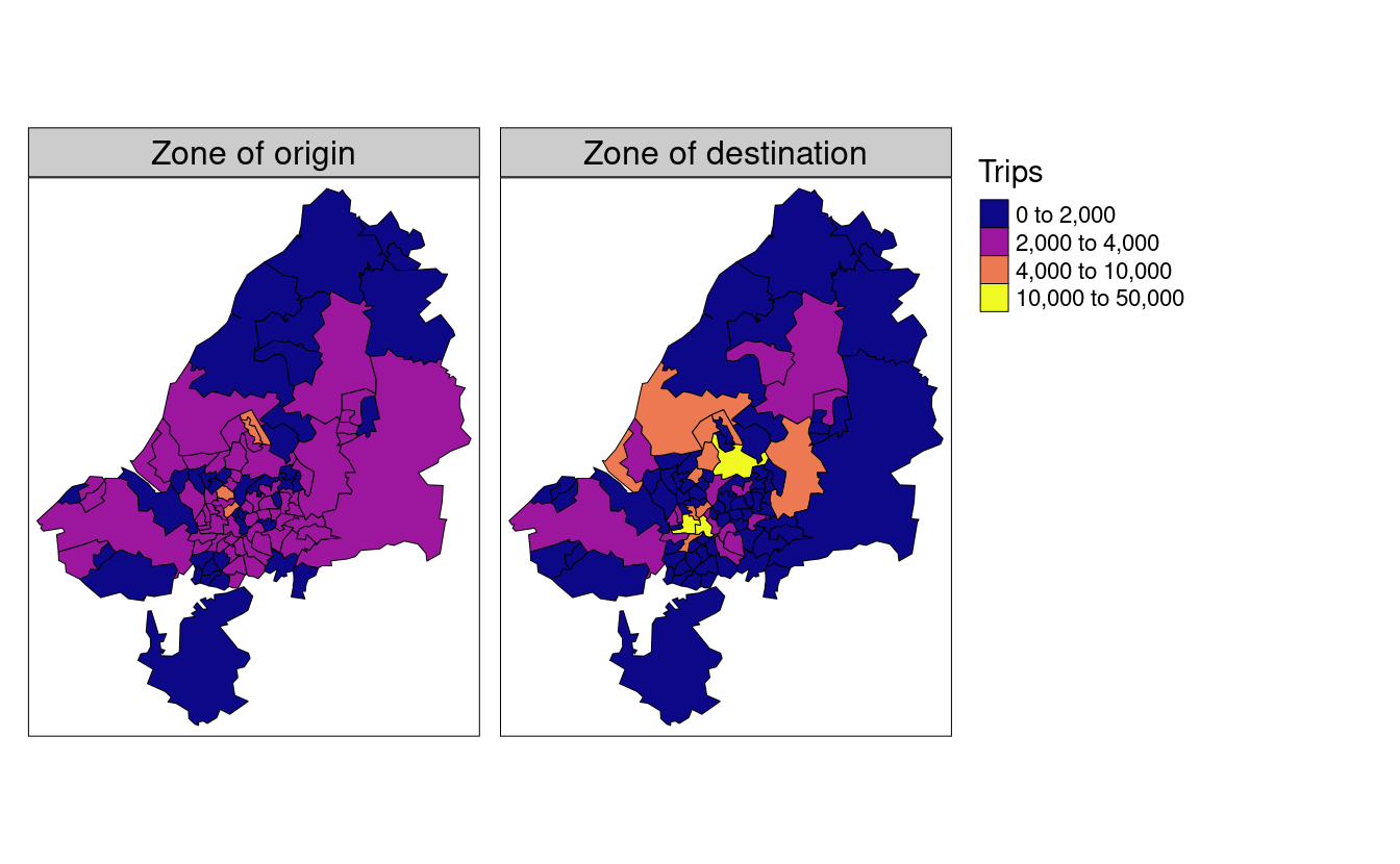
FIGURE 12.2: Number of trips (commuters) living and working in the region. The left map shows zone of origin of commute trips; the right map shows zone of destination (generated by the script 12-zones.R).
12.4 Desire lines
Unlike zones, which represent trip origins and destinations, desire lines connect the centroid of the origin and the destination zone, and thereby represent where people desire to go between zones. They represent the quickest ‘bee line’ or ‘crow flies’ route between A and B that would be taken, if it were not for obstacles such as buildings and windy roads getting in the way (we will see how to convert desire lines into routes in the next section).
We have already loaded data representing desire lines in the dataset bristol_od.
This origin-destination (OD) data frame object represents the number of people traveling between the zone represented in o and d, as illustrated in Table 12.1.
To arrange the OD data by all trips and then filter-out only the top 5, type (please refer to Chapter 3 for a detailed description of non-spatial attribute operations):
| o | d | all | bicycle | foot | car_driver | train |
|---|---|---|---|---|---|---|
| E02003043 | E02003043 | 1493 | 66 | 1296 | 64 | 8 |
| E02003047 | E02003043 | 1300 | 287 | 751 | 148 | 8 |
| E02003031 | E02003043 | 1221 | 305 | 600 | 176 | 7 |
| E02003037 | E02003043 | 1186 | 88 | 908 | 110 | 3 |
| E02003034 | E02003043 | 1177 | 281 | 711 | 100 | 7 |
The resulting table provides a snapshot of Bristolian travel patterns in terms of commuting (travel to work).
It demonstrates that walking is the most popular mode of transport among the top 5 origin-destination pairs, that zone E02003043 is a popular destination (Bristol city center, the destination of all the top 5 OD pairs), and that the intrazonal trips, from one part of zone E02003043 to another (first row of Table 12.1), constitute the most traveled OD pair in the dataset.
But from a policy perspective, the raw data presented in Table 12.1 is of limited use:
aside from the fact that it contains only a tiny portion of the 2,910 OD pairs, it tells us little about where policy measures are needed, or what proportion of trips are made by walking and cycling.
The following command calculates the percentage of each desire line that is made by these active modes:
bristol_od$Active = (bristol_od$bicycle + bristol_od$foot) /
  bristol_od$all * 100
There are two main types of OD pair:
interzonal and intrazonal.
Interzonal OD pairs represent travel between zones in which the destination is different from the origin.
Intrazonal OD pairs represent travel within the same zone (see the top row of Table 12.1).
The following code chunk splits od_bristol into these two types:
The next step is to convert the interzonal OD pairs into an sf object representing desire lines that can be plotted on a map with the stplanr function od2line().77
desire_lines = od2line(od_inter, zones_od)
#> Creating centroids representing desire line start and end points.
An illustration of the results is presented in Figure 12.3, a simplified version of which is created with the following command (see the code in 12-desire.R to reproduce the figure exactly and Chapter 8 for details on visualization with tmap):
qtm(desire_lines, lines.lwd = "all")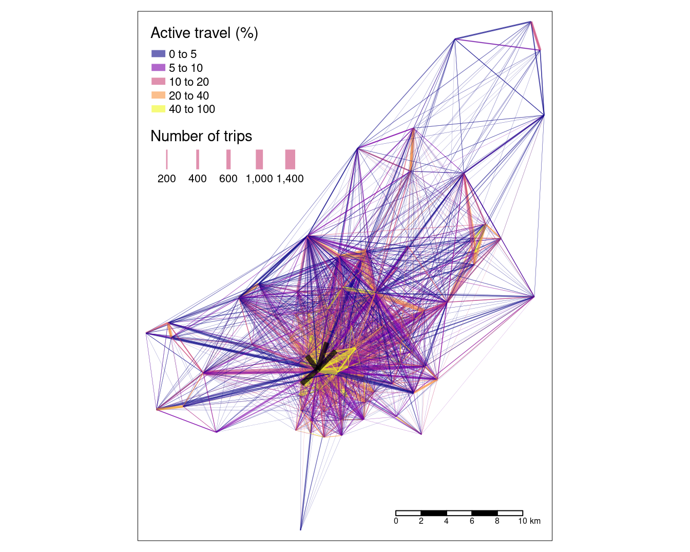
FIGURE 12.3: Desire lines representing trip patterns in Bristol, with width representing number of trips and color representing the percentage of trips made by active modes (walking and cycling). The four black lines represent the interzonal OD pairs in Table 7.1.
The map shows that the city center dominates transport patterns in the region, suggesting policies should be prioritized there, although a number of peripheral sub-centers can also be seen. Next it would be interesting to have a look at the distribution of interzonal modes, e.g. between which zones is cycling the least or the most common means of transport.
12.5 Routes
From a geographer’s perspective, routes are desire lines that are no longer straight: the origin and destination points are the same, but the pathway to get from A to B is more complex. Desire lines contain only two vertices (their beginning and end points) but routes can contain hundreds of vertices if they cover a large distance or represent travel patterns on an intricate road network (routes on simple grid-based road networks require relatively few vertices). Routes are generated from desire lines — or more commonly origin-destination pairs — using routing services which either run locally or remotely.
Local routing can be advantageous in terms of speed of execution and control over the weighting profile for different modes of transport. Disadvantages include the difficulty of representing complex networks locally; temporal dynamics (primarily due to traffic); and the need for specialized software such as ‘pgRouting,’ an issue that developers of packages stplanr and dodgr seek to address.
Remote routing services, by contrast, use a web API to send queries about origins and destinations and return results generated on a powerful server running specialised software. This gives remote routing services various advantages, including that they usually
- have global coverage;
- are update regularly; and
- run on specialist hardware and software set-up for the job.
Disadvantages of remote routing services include speed (they rely on data transfer over the internet) and price (the Google routing API, for example, limits the number of free queries). The googleway package provides an interface to Google’s routing API. Free (but rate limited) routing service include OSRM and openrouteservice.org.
Instead of routing all desire lines generated in the previous section, which would be time and memory-consuming, we will focus on the desire lines of policy interest.
The benefits of cycling trips are greatest when they replace car trips.
Clearly, not all car trips can realistically be replaced by cycling.
However, 5 km Euclidean distance (or around 6-8 km of route distance) can realistically be cycled by many people, especially if they are riding an electric bicycle (‘ebike’).
We will therefore only route desire lines along which a high (300+) number of car trips take place that are up to 5 km in distance.
This routing is done in the code chunk below by the stplanr function route(), which creates sf objects representing routes on the transport network, one for each desire line.
desire_lines$distance = as.numeric(st_length(desire_lines))
desire_carshort = dplyr::filter(desire_lines, car_driver > 300 & distance < 5000)
route_carshort = route(l = desire_carshort, route_fun = route_osrm)st_length() determines the length of a linestring, and falls into the distance relations category (see also Section 4.2.6).
Subsequently, we apply a simple attribute filter operation (see Section 3.2.1) before letting the OSRM service do the routing on a remote server.
Note that the routing only works with a working internet connection.
We could keep the new route_carshort object separate from the straight line representation of the same trip in desire_carshort but, from a data management perspective, it makes more sense to combine them: they represent the same trip.
The new route dataset contains distance (referring to route distance this time) and duration fields (in seconds) which could be useful.
However, for the purposes of this chapter, we are only interested in the geometry, from which route distance can be calculated.
The following command makes use of the ability of simple features objects to contain multiple geographic columns:
desire_carshort$geom_car = st_geometry(route_carshort)This allows plotting the desire lines along which many short car journeys take place alongside likely routes traveled by cars by referring to each geometry column separately (desire_carshort$geometry and desire_carshort$geom_car in this case).
Making the width of the routes proportional to the number of car journeys that could potentially be replaced provides an effective way to prioritize interventions on the road network (Lovelace et al. 2017).
The code chunk below plots the desire lines and routes, resulting in Figure 12.4 which shows routes along which people drive short distances:78
plot(st_geometry(desire_carshort))
plot(desire_carshort$geom_car, col = "red", add = TRUE)
plot(st_geometry(st_centroid(zones_od)), add = TRUE)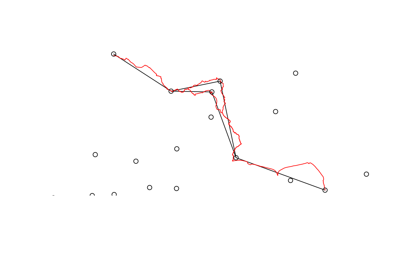
FIGURE 12.4: Routes along which many (300+) short (<5km Euclidean distance) car journeys are made (red) overlaying desire lines representing the same trips (black) and zone centroids (dots).
Plotting the results on an interactive map, with mapview::mapview(desire_carshort$geom_car) for example, shows that many short car trips take place in and around Bradley Stoke.
It is easy to find explanations for the area’s high level of car dependency: according to Wikipedia, Bradley Stoke is “Europe’s largest new town built with private investment,” suggesting limited public transport provision.
Furthermore, the town is surrounded by large (cycling unfriendly) road structures, “such as junctions on both the M4 and M5 motorways” (Tallon 2007).
There are many benefits of converting travel desire lines into likely routes of travel from a policy perspective, primary among them the ability to understand what it is about the surrounding environment that makes people travel by a particular mode. We discuss future directions of research building on the routes in Section 12.9. For the purposes of this case study, suffice to say that the roads along which these short car journeys travel should be prioritized for investigation to understand how they can be made more conducive to sustainable transport modes. One option would be to add new public transport nodes to the network. Such nodes are described in the next section.
12.6 Nodes
Nodes in geographic transport data are zero-dimensional features (points) among the predominantly one-dimensional features (lines) that comprise the network. There are two types of transport nodes:
- Nodes not directly on the network such as zone centroids — covered in the next section — or individual origins and destinations such as houses and workplaces.
- Nodes that are a part of transport networks, representing individual pathways, intersections between pathways (junctions) and points for entering or exiting a transport network such as bus stops and train stations.
Transport networks can be represented as graphs, in which each segment is connected (via edges representing geographic lines) to one or more other edges in the network. Nodes outside the network can be added with “centroid connectors”, new route segments to nearby nodes on the network (Hollander 2016).79 Every node in the network is then connected by one or more ‘edges’ that represent individual segments on the network. We will see how transport networks can be represented as graphs in Section 12.7.
Public transport stops are particularly important nodes that can be represented as either type of node: a bus stop that is part of a road, or a large rail station that is represented by its pedestrian entry point hundreds of meters from railway tracks.
We will use railway stations to illustrate public transport nodes, in relation to the research question of increasing cycling in Bristol.
These stations are provided by spDataLarge in bristol_stations.
A common barrier preventing people from switching away from cars for commuting to work is that the distance from home to work is too far to walk or cycle. Public transport can reduce this barrier by providing a fast and high-volume option for common routes into cities. From an active travel perspective, public transport ‘legs’ of longer journeys divide trips into three:
- The origin leg, typically from residential areas to public transport stations
- The public transport leg, which typically goes from the station nearest a trip’s origin to the station nearest its destination
- The destination leg, from the station of alighting to the destination
Building on the analysis conducted in Section 12.4, public transport nodes can be used to construct three-part desire lines for trips that can be taken by bus and (the mode used in this example) rail.
The first stage is to identify the desire lines with most public transport travel, which in our case is easy because our previously created dataset desire_lines already contains a variable describing the number of trips by train (the public transport potential could also be estimated using public transport routing services such as OpenTripPlanner).
To make the approach easier to follow, we will select only the top three desire lines in terms of rails use:
desire_rail = top_n(desire_lines, n = 3, wt = train)The challenge now is to ‘break-up’ each of these lines into three pieces, representing travel via public transport nodes.
This can be done by converting a desire line into a multiline object consisting of three line geometries representing origin, public transport and destination legs of the trip.
This operation can be divided into three stages: matrix creation (of origins, destinations and the ‘via’ points representing rail stations), identification of nearest neighbors and conversion to multilines.
These are undertaken by line_via().
This stplanr function takes input lines and points and returns a copy of the desire lines — see the Desire Lines Extended vignette on the geocompr.github.io website and ?line_via for details on how this works.
The output is the same as the input line, except it has new geometry columns representing the journey via public transport nodes, as demonstrated below:
ncol(desire_rail)
#> [1] 10
desire_rail = line_via(desire_rail, bristol_stations)
ncol(desire_rail)
#> [1] 13
As illustrated in Figure 12.5, the initial desire_rail lines now have three additional geometry list columns representing travel from home to the origin station, from there to the destination, and finally from the destination station to the destination.
In this case, the destination leg is very short (walking distance) but the origin legs may be sufficiently far to justify investment in cycling infrastructure to encourage people to cycle to the stations on the outward leg of peoples’ journey to work in the residential areas surrounding the three origin stations in Figure 12.5.
FIGURE 12.5: Station nodes (red dots) used as intermediary points that convert straight desire lines with high rail usage (black) into three legs: to the origin station (red) via public transport (gray) and to the destination (a very short blue line).
12.7 Route networks
The data used in this section was downloaded using osmdata.
To avoid having to request the data from OSM repeatedly, we will use the bristol_ways object, which contains point and line data for the case study area (see ?bristol_ways):
summary(bristol_ways)
#>      highway        maxspeed         ref                geometry
#>  cycleway:1317   30 mph : 925   A38    : 214   LINESTRING   :4915
#>  rail    : 832   20 mph : 556   A432   : 146   epsg:4326    :   0
#>  road    :2766   40 mph : 397   M5     : 144   +proj=long...:   0
#>                  70 mph : 328   A4018  : 124
#>                  50 mph : 158   A420   : 115
#>                  (Other): 490   (Other):1877
#>                  NA's   :2061   NA's   :2295
The above code chunk loaded a simple feature object representing around 3,000 segments on the transport network. This an easily manageable dataset size (transport datasets can be large, but it’s best to start small).
As mentioned, route networks can usefully be represented as mathematical graphs, with nodes on the network connected by edges.
A number of R packages have been developed for dealing with such graphs, notably igraph.
One can manually convert a route network into an igraph object, but the geographic attributes will be lost.
To overcome this issue SpatialLinesNetwork() was developed in the stplanr package to represent route networks simultaneously as graphs and a set of geographic lines.
This function is demonstrated below using a subset of the bristol_ways object used in previous sections.
ways_freeway = bristol_ways %>% filter(maxspeed == "70 mph")
ways_sln = SpatialLinesNetwork(ways_freeway)
#> Warning in SpatialLinesNetwork.sf(ways_freeway): Graph composed of multiple
#> subgraphs, consider cleaning it with sln_clean_graph().
slotNames(ways_sln)
#> [1] "sl"          "g"           "nb"          "weightfield"
weightfield(ways_sln)
#> [1] "length"
class(ways_sln@g)
#> [1] "igraph"
The output of the previous code chunk shows that ways_sln is a composite object with various ‘slots.’
These include: the spatial component of the network (named sl), the graph component (g) and the ‘weightfield,’ the edge variable used for shortest path calculation (by default segment distance).
ways_sln is of class sfNetwork, defined by the S4 class system.
This means that each component can be accessed using the @ operator, which is used below to extract its graph component and process it using the igraph package, before plotting the results in geographic space.
In the example below, the ‘edge betweenness’, meaning the number of shortest paths passing through each edge, is calculated (see ?igraph::betweenness for further details and Figure 12.6).
The results demonstrate that each graph edge represents a segment: the segments near the center of the road network have the greatest betweenness scores.
e = igraph::edge_betweenness(ways_sln@g)
plot(ways_sln@sl$geometry, lwd = e / 500)
FIGURE 12.6: Illustration of a small route network, with segment thickness proportional to its betweenness, generated using the igraph package and described in the text.
One can also find the shortest route between origins and destinations using this graph representation of the route network.
This can be done with functions such as sum_network_routes() from stplanr, which undertakes ‘local routing’ (see Section 12.5).
12.8 Prioritizing new infrastructure
This chapter’s final practical section demonstrates the policy-relevance of geocomputation for transport applications by identifying locations where new transport infrastructure may be needed. Clearly, the types of analysis presented here would need to be extended and complemented by other methods to be used in real-world applications, as discussed in Section 12.9. However, each stage could be useful on its own, and feed into wider analyses. To summarize, these were: identifying short but car-dependent commuting routes (generated from desire lines) in Section 12.5; creating desire lines representing trips to rail stations in Section 12.6; and analysis of transport systems at the route network using graph theory in Section 12.7.
The final code chunk of this chapter combines these strands of analysis.
It adds the car-dependent routes in route_carshort with a newly created object, route_rail and creates a new column representing the amount of travel along the centroid-to-centroid desire lines they represent:
route_rail = desire_rail %>%
  st_set_geometry("leg_orig") %>%
  route(l = ., route_fun = route_osrm) %>%
  select(names(route_carshort))
route_cycleway = rbind(route_rail, route_carshort)
route_cycleway$all = c(desire_rail$all, desire_carshort$all)
The results of the preceding code are visualized in Figure 12.7, which shows routes with high levels of car dependency and highlights opportunities for cycling rail stations (the subsequent code chunk creates a simple version of the figure — see code/12-cycleways.R to reproduce the figure exactly).
The method has some limitations: in reality, people do not travel to zone centroids or always use the shortest route algorithm for a particular mode.
However, the results demonstrate routes along which cycle paths could be prioritized from car dependency and public transport perspectives.
qtm(route_cycleway, lines.lwd = "all")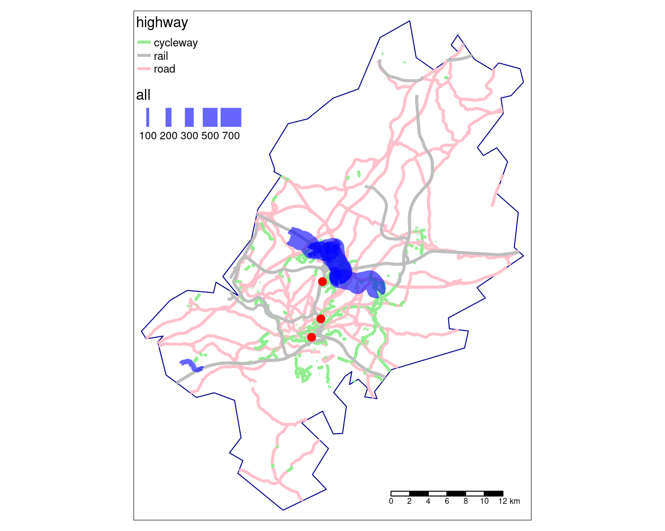
FIGURE 12.7: Potential routes along which to prioritise cycle infrastructure in Bristol, based on access key rail stations (red dots) and routes with many short car journeys (north of Bristol surrounding Stoke Bradley). Line thickness is proportional to number of trips.
The results may look more attractive in an interactive map, but what do they mean? The routes highlighted in Figure 12.7 suggest that transport systems are intimately linked to the wider economic and social context. The example of Stoke Bradley is a case in point: its location, lack of public transport services and active travel infrastructure help explain why it is so highly car-dependent. The wider point is that car dependency has a spatial distribution which has implications for sustainable transport policies (Hickman, Ashiru, and Banister 2011).
12.9 Future directions of travel
This chapter provides a taste of the possibilities of using geocomputation for transport research. It has explored some key geographic elements that make-up a city’s transport system using open data and reproducible code. The results could help plan where investment is needed.
Transport systems operate at multiple interacting levels, meaning that geocomputational methods have great potential to generate insights into how they work. There is much more that could be done in this area: it would be possible to build on the foundations presented in this chapter in many directions. Transport is the fastest growing source of greenhouse gas emissions in many countries, and is set to become “the largest GHG emitting sector, especially in developed countries” (see EURACTIV.com). Because of the highly unequal distribution of transport-related emissions across society, and the fact that transport (unlike food and heating) is not essential for well-being, there is great potential for the sector to rapidly decarbonize through demand reduction, electrification of the vehicle fleet and the uptake of active travel modes such as walking and cycling. Further exploration of such ‘transport futures’ at the local level represents promising direction of travel for transport-related geocomputational research.
Methodologically, the foundations presented in this chapter could be extended by including more variables in the analysis. Characteristics of the route such as speed limits, busyness and the provision of protected cycling and walking paths could be linked to ‘mode-split’ (the proportion of trips made by different modes of transport). By aggregating OpenStreetMap data using buffers and geographic data methods presented in Chapters 3 and 4, for example, it would be possible to detect the presence of green space in close proximity to transport routes. Using R’s statistical modeling capabilities, this could then be used to predict current and future levels of cycling, for example.
This type of analysis underlies the Propensity to Cycle Tool (PCT), a publicly accessible (see www.pct.bike) mapping tool developed in R that is being used to prioritize investment in cycling across England (Lovelace et al. 2017). Similar tools could be used to encourage evidence-based transport policies related to other topics such as air pollution and public transport access around the world.
12.10 Exercises
- What is the total distance of cycleways that would be constructed if all the routes presented in Figure 12.7 were to be constructed?
- Bonus: find two ways of arriving at the same answer.
- What proportion of trips represented in the
desire_linesare accounted for in theroute_cyclewayobject?- Bonus: what proportion of trips cross the proposed routes?
- Advanced: write code that would increase this proportion.
- The analysis presented in this chapter is designed for teaching how geocomputation methods can be applied to transport research. If you were to do this ‘for real’ for local government or a transport consultancy, what top 3 things would you do differently?
- Clearly, the routes identified in Figure 12.7 only provide part of the picture. How would you extend the analysis to incorporate more trips that could potentially be cycled?
- Imagine that you want to extend the scenario by creating key areas (not routes) for investment in place-based cycling policies such as car-free zones, cycle parking points and reduced car parking strategy. How could raster data assist with this work?
- Bonus: develop a raster layer that divides the Bristol region into 100 cells (10 by 10) and provide a metric related to transport policy, such as number of people trips that pass through each cell by walking or the average speed limit of roads, from the
bristol_waysdataset (the approach taken in Chapter 13).
- Bonus: develop a raster layer that divides the Bristol region into 100 cells (10 by 10) and provide a metric related to transport policy, such as number of people trips that pass through each cell by walking or the average speed limit of roads, from the