8 Making maps with R
Prerequisites
- This chapter requires the following packages that we have already been using:
- In addition, it uses the following visualization packages (also install shiny if you want to develop interactive mapping applications):
8.1 Introduction
A satisfying and important aspect of geographic research is communicating the results.
Map making — the art of cartography — is an ancient skill that involves communication, intuition, and an element of creativity.
Static mapping in R is straightforward with the plot() function, as we saw in Section 2.2.3.
It is possible to create advanced maps using base R methods (Murrell 2016).
The focus of this chapter, however, is cartography with dedicated map-making packages.
When learning a new skill, it makes sense to gain depth-of-knowledge in one area before branching out.
Map making is no exception, hence this chapter’s coverage of one package (tmap) in depth rather than many superficially.
In addition to being fun and creative, cartography also has important practical applications. A carefully crafted map can be the best way of communicating the results of your work, but poorly designed maps can leave a bad impression. Common design issues include poor placement, size and readability of text and careless selection of colors, as outlined in the style guide of the Journal of Maps. Furthermore, poor map making can hinder the communication of results (Brewer 2015):
Amateur-looking maps can undermine your audience’s ability to understand important information and weaken the presentation of a professional data investigation.
Maps have been used for several thousand years for a wide variety of purposes. Historic examples include maps of buildings and land ownership in the Old Babylonian dynasty more than 3000 years ago and Ptolemy’s world map in his masterpiece Geography nearly 2000 years ago (Talbert 2014).
Map making has historically been an activity undertaken only by, or on behalf of, the elite. This has changed with the emergence of open source mapping software such as the R package tmap and the ‘print composer’ in QGIS which enable anyone to make high-quality maps, enabling ‘citizen science.’ Maps are also often the best way to present the findings of geocomputational research in a way that is accessible. Map making is therefore a critical part of geocomputation and its emphasis not only on describing, but also changing the world.
This chapter shows how to make a wide range of maps. The next section covers a range of static maps, including aesthetic considerations, facets and inset maps. Sections 8.3 to 8.5 cover animated and interactive maps (including web maps and mapping applications). Finally, Section 8.6 covers a range of alternative map-making packages including ggplot2 and cartogram.
8.2 Static maps
Static maps are the most common type of visual output from geocomputation.
Standard formats include .png and .pdf for raster and vector outputs respectively.
Initially, static maps were the only type of maps that R could produce.
Things advanced with the release of sp (see E. J. Pebesma and Bivand 2005) and many techniques for map making have been developed since then.
However, despite the innovation of interactive mapping, static plotting was still the emphasis of geographic data visualisation in R a decade later (Cheshire and Lovelace 2015).
The generic plot() function is often the fastest way to create static maps from vector and raster spatial objects (see sections 2.2.3 and 2.3.3).
Sometimes, simplicity and speed are priorities, especially during the development phase of a project, and this is where plot() excels.
The base R approach is also extensible, with plot() offering dozens of arguments.
Another approach is the grid package which allows low level control of static maps, as illustrated in Chapter 14 of Murrell (2016).
This section focuses on tmap and emphasizes the important aesthetic and layout options.
tmap is a powerful and flexible map-making package with sensible defaults.
It has a concise syntax that allows for the creation of attractive maps with minimal code which will be familiar to ggplot2 users.
It also has the unique capability to generate static and interactive maps using the same code via tmap_mode().
Finally, it accepts a wider range of spatial classes (including raster objects) than alternatives such as ggplot2 (see the vignettes tmap-getstarted and tmap-changes-v2, as well as Tennekes (2018), for further documentation).
8.2.1 tmap basics
Like ggplot2, tmap is based on the idea of a ‘grammar of graphics’ (Wilkinson and Wills 2005).
This involves a separation between the input data and the aesthetics (how data are visualised): each input dataset can be ‘mapped’ in a range of different ways including location on the map (defined by data’s geometry), color, and other visual variables.
The basic building block is tm_shape() (which defines input data, raster and vector objects), followed by one or more layer elements such as tm_fill() and tm_dots().
This layering is demonstrated in the chunk below, which generates the maps presented in Figure 8.1:
# Add fill layer to nz shape
tm_shape(nz) +
  tm_fill()
# Add border layer to nz shape
tm_shape(nz) +
  tm_borders()
# Add fill and border layers to nz shape
tm_shape(nz) +
  tm_fill() +
tm_borders() 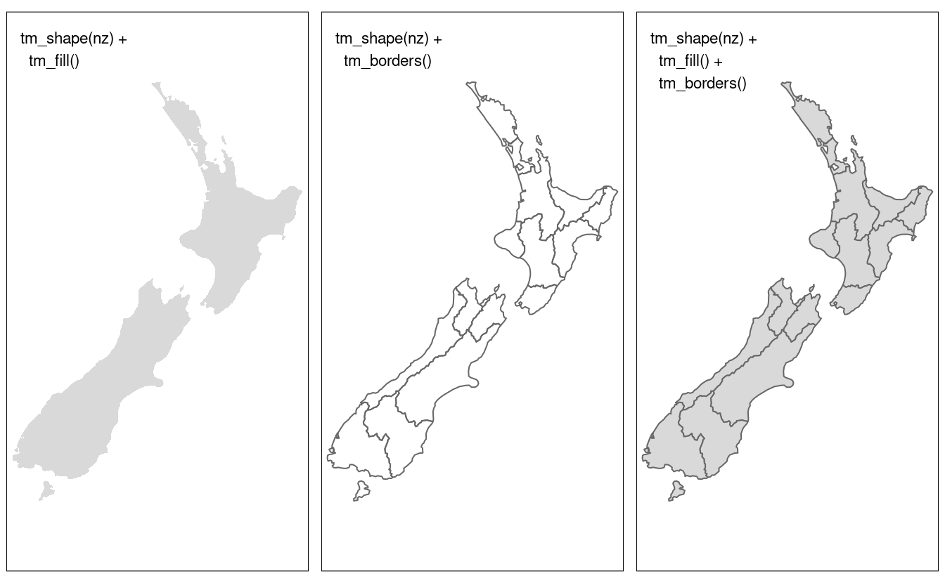
FIGURE 8.1: New Zealand’s shape plotted with fill (left), border (middle) and fill and border (right) layers added using tmap functions.
The object passed to tm_shape() in this case is nz, an sf object representing the regions of New Zealand (see Section 2.2.1 for more on sf objects).
Layers are added to represent nz visually, with tm_fill() and tm_borders() creating shaded areas (left panel) and border outlines (middle panel) in Figure 8.1, respectively.
This is an intuitive approach to map making:
the common task of adding new layers is undertaken by the addition operator +, followed by tm_*().
The asterisk (*) refers to a wide range of layer types which have self-explanatory names including fill, borders (demonstrated above), bubbles, text and raster (see help("tmap-element") for a full list).
This layering is illustrated in the right panel of Figure 8.1, the result of adding a border on top of the fill layer.
qtm() is a handy function to create quick thematic maps (hence the snappy name).
It is concise and provides a good default visualization in many cases:
qtm(nz), for example, is equivalent to tm_shape(nz) + tm_fill() + tm_borders().
Further, layers can be added concisely using multiple qtm() calls, such as qtm(nz) + qtm(nz_height).
The disadvantage is that it makes aesthetics of individual layers harder to control, explaining why we avoid teaching it in this chapter.
8.2.2 Map objects
A useful feature of tmap is its ability to store objects representing maps.
The code chunk below demonstrates this by saving the last plot in Figure 8.1 as an object of class tmap (note the use of tm_polygons() which condenses tm_fill() + tm_borders() into a single function):
map_nz = tm_shape(nz) + tm_polygons()
class(map_nz)
#> [1] "tmap"
map_nz can be plotted later, for example by adding additional layers (as shown below) or simply running map_nz in the console, which is equivalent to print(map_nz).
New shapes can be added with + tm_shape(new_obj).
In this case new_obj represents a new spatial object to be plotted on top of preceding layers.
When a new shape is added in this way, all subsequent aesthetic functions refer to it, until another new shape is added.
This syntax allows the creation of maps with multiple shapes and layers, as illustrated in the next code chunk which uses the function tm_raster() to plot a raster layer (with alpha set to make the layer semi-transparent):
Building on the previously created map_nz object, the preceding code creates a new map object map_nz1 that contains another shape (nz_elev) representing average elevation across New Zealand (see Figure 8.2, left).
More shapes and layers can be added, as illustrated in the code chunk below which creates nz_water, representing New Zealand’s territorial waters, and adds the resulting lines to an existing map object.
nz_water = st_union(nz) %>% st_buffer(22200) %>%
  st_cast(to = "LINESTRING")
map_nz2 = map_nz1 +
  tm_shape(nz_water) + tm_lines()
There is no limit to the number of layers or shapes that can be added to tmap objects.
The same shape can even be used multiple times.
The final map illustrated in Figure 8.2 is created by adding a layer representing high points (stored in the object nz_height) onto the previously created map_nz2 object with tm_dots() (see ?tm_dots and ?tm_bubbles for details on tmap’s point plotting functions).
The resulting map, which has four layers, is illustrated in the right-hand panel of Figure 8.2:
A useful and little known feature of tmap is that multiple map objects can be arranged in a single ‘metaplot’ with tmap_arrange().
This is demonstrated in the code chunk below which plots map_nz1 to map_nz3, resulting in Figure 8.2.
tmap_arrange(map_nz1, map_nz2, map_nz3)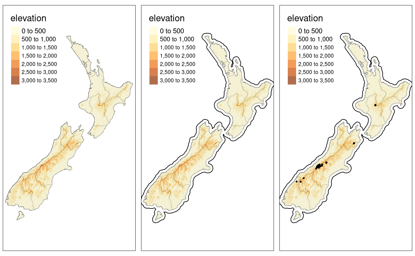
FIGURE 8.2: Maps with additional layers added to the final map of Figure 8.1.
More elements can also be added with the + operator.
Aesthetic settings, however, are controlled by arguments to layer functions.
8.2.3 Aesthetics
The plots in the previous section demonstrate tmap’s default aesthetic settings.
Gray shades are used for tm_fill() and tm_bubbles() layers and a continuous black line is used to represent lines created with tm_lines().
Of course, these default values and other aesthetics can be overridden.
The purpose of this section is to show how.
There are two main types of map aesthetics: those that change with the data and those that are constant.
Unlike ggplot2, which uses the helper function aes() to represent variable aesthetics, tmap accepts aesthetic arguments that are either variable fields (based on column names) or constant values.41
The most commonly used aesthetics for fill and border layers include color, transparency, line width and line type, set with col, alpha, lwd, and lty arguments, respectively.
The impact of setting these with fixed values is illustrated in Figure 8.3.
ma1 = tm_shape(nz) + tm_fill(col = "red")
ma2 = tm_shape(nz) + tm_fill(col = "red", alpha = 0.3)
ma3 = tm_shape(nz) + tm_borders(col = "blue")
ma4 = tm_shape(nz) + tm_borders(lwd = 3)
ma5 = tm_shape(nz) + tm_borders(lty = 2)
ma6 = tm_shape(nz) + tm_fill(col = "red", alpha = 0.3) +
  tm_borders(col = "blue", lwd = 3, lty = 2)
tmap_arrange(ma1, ma2, ma3, ma4, ma5, ma6)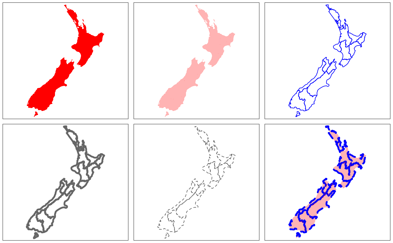
FIGURE 8.3: The impact of changing commonly used fill and border aesthetics to fixed values.
Like base R plots, arguments defining aesthetics can also receive values that vary. Unlike the base R code below (which generates the left panel in Figure 8.4), tmap aesthetic arguments will not accept a numeric vector:
plot(st_geometry(nz), col = nz$Land_area)  # works
tm_shape(nz) + tm_fill(col = nz$Land_area) # fails
#> Error: Fill argument neither colors nor valid variable name(s)
Instead col (and other aesthetics that can vary such as lwd for line layers and size for point layers) requires a character string naming an attribute associated with the geometry to be plotted.
Thus, one would achieve the desired result as follows (plotted in the right-hand panel of Figure 8.4):
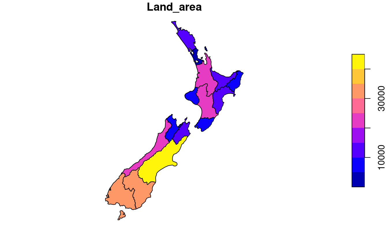
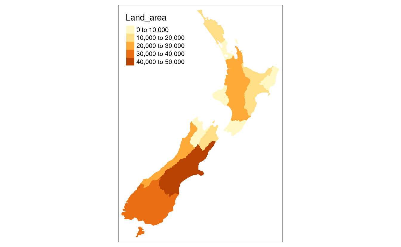
FIGURE 8.4: Comparison of base (left) and tmap (right) handling of a numeric color field.
An important argument in functions defining aesthetic layers such as tm_fill() is title, which sets the title of the associated legend.
The following code chunk demonstrates this functionality by providing a more attractive name than the variable name Land_area (note the use of expression() to create superscript text):
legend_title = expression("Area (km"^2*")")
map_nza = tm_shape(nz) +
  tm_fill(col = "Land_area", title = legend_title) + tm_borders()
8.2.4 Color settings
Color settings are an important part of map design. They can have a major impact on how spatial variability is portrayed as illustrated in Figure 8.5. This shows four ways of coloring regions in New Zealand depending on median income, from left to right (and demonstrated in the code chunk below):
- The default setting uses ‘pretty’ breaks, described in the next paragraph
-
breaksallows you to manually set the breaks -
nsets the number of bins into which numeric variables are categorized -
palettedefines the color scheme, for exampleBuGn
tm_shape(nz) + tm_polygons(col = "Median_income")
breaks = c(0, 3, 4, 5) * 10000
tm_shape(nz) + tm_polygons(col = "Median_income", breaks = breaks)
tm_shape(nz) + tm_polygons(col = "Median_income", n = 10)
tm_shape(nz) + tm_polygons(col = "Median_income", palette = "BuGn")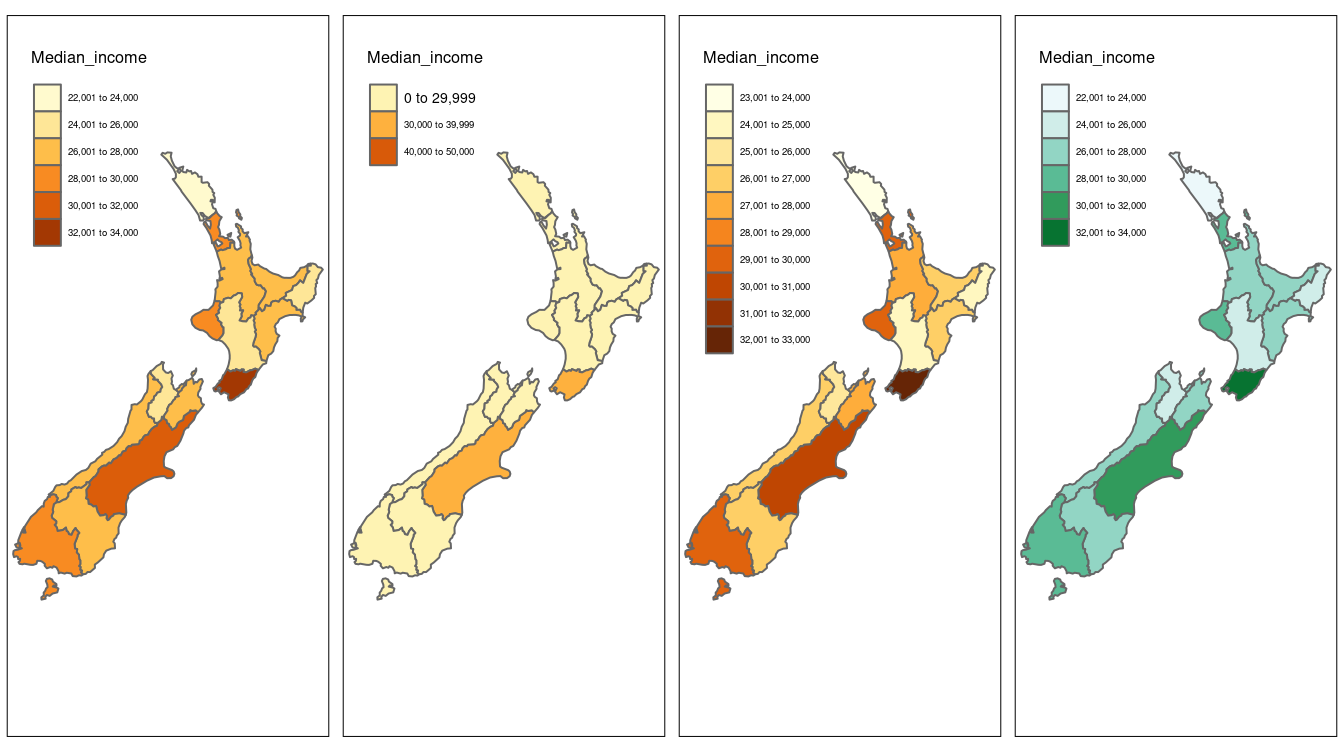
FIGURE 8.5: Illustration of settings that affect color settings. The results show (from left to right): default settings, manual breaks, n breaks, and the impact of changing the palette.
Another way to change color settings is by altering color break (or bin) settings.
In addition to manually setting breaks tmap allows users to specify algorithms to automatically create breaks with the style argument.
Here are six of the most useful break styles:
-
style = "pretty", the default setting, rounds breaks into whole numbers where possible and spaces them evenly; -
style = "equal"divides input values into bins of equal range and is appropriate for variables with a uniform distribution (not recommended for variables with a skewed distribution as the resulting map may end-up having little color diversity); -
style = "quantile"ensures the same number of observations fall into each category (with the potential downside that bin ranges can vary widely); -
style = "jenks"identifies groups of similar values in the data and maximizes the differences between categories; -
style = "cont"(and"order") present a large number of colors over continuous color fields and are particularly suited for continuous rasters ("order"can help visualize skewed distributions); -
style = "cat"was designed to represent categorical values and assures that each category receives a unique color.
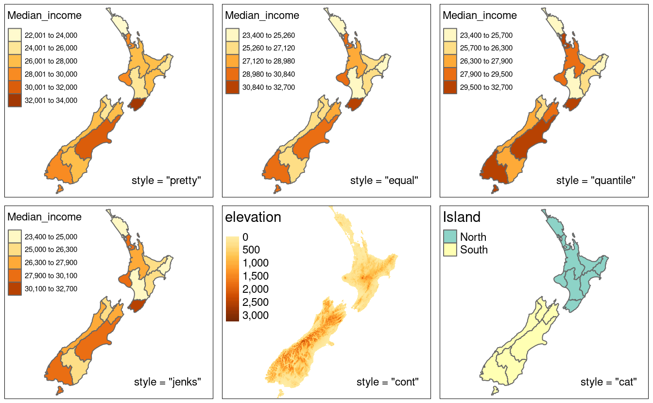
FIGURE 8.6: Illustration of different binning methods set using the style argument in tmap.
style is an argument of tmap functions, in fact it originates as an argument in classInt::classIntervals() — see the help page of this function for details.
Palettes define the color ranges associated with the bins and determined by the breaks, n, and style arguments described above.
The default color palette is specified in tm_layout() (see Section 8.2.5 to learn more); however, it could be quickly changed using the palette argument.
It expects a vector of colors or a new color palette name, which can be selected interactively with tmaptools::palette_explorer().
You can add a - as prefix to reverse the palette order.
There are three main groups of color palettes: categorical, sequential and diverging (Figure 8.7), and each of them serves a different purpose. Categorical palettes consist of easily distinguishable colors and are most appropriate for categorical data without any particular order such as state names or land cover classes. Colors should be intuitive: rivers should be blue, for example, and pastures green. Avoid too many categories: maps with large legends and many colors can be uninterpretable.42
The second group is sequential palettes.
These follow a gradient, for example from light to dark colors (light colors tend to represent lower values), and are appropriate for continuous (numeric) variables.
Sequential palettes can be single (Blues go from light to dark blue, for example) or multi-color/hue (YlOrBr is gradient from light yellow to brown via orange, for example), as demonstrated in the code chunk below — output not shown, run the code yourself to see the results!
tm_shape(nz) + tm_polygons("Population", palette = "Blues")
tm_shape(nz) + tm_polygons("Population", palette = "YlOrBr")
The last group, diverging palettes, typically range between three distinct colors (purple-white-green in Figure 8.7) and are usually created by joining two single-color sequential palettes with the darker colors at each end.
Their main purpose is to visualize the difference from an important reference point, e.g., a certain temperature, the median household income or the mean probability for a drought event.
The reference point’s value can be adjusted in tmap using the midpoint argument.
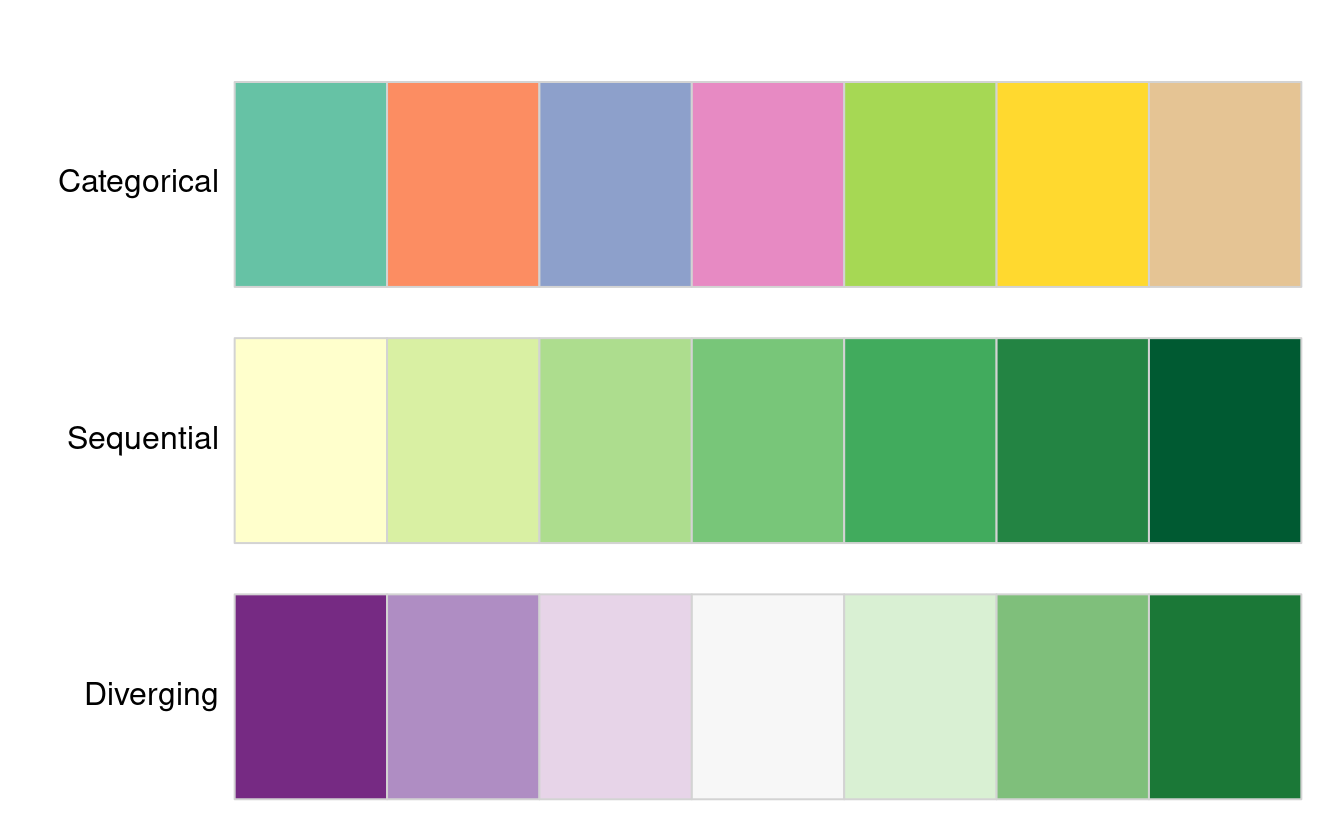
FIGURE 8.7: Examples of categorical, sequential and diverging palettes.
There are two important principles for consideration when working with colors: perceptibility and accessibility. Firstly, colors on maps should match our perception. This means that certain colors are viewed through our experience and also cultural lenses. For example, green colors usually represent vegetation or lowlands and blue is connected with water or cool. Color palettes should also be easy to understand to effectively convey information. It should be clear which values are lower and which are higher, and colors should change gradually. This property is not preserved in the rainbow color palette; therefore, we suggest avoiding it in geographic data visualization (Borland and Taylor II 2007). Instead, the viridis color palettes, also available in tmap, can be used. Secondly, changes in colors should be accessible to the largest number of people. Therefore, it is important to use colorblind friendly palettes as often as possible.43
8.2.5 Layouts
The map layout refers to the combination of all map elements into a cohesive map. Map elements include among others the objects to be mapped, the title, the scale bar, margins and aspect ratios, while the color settings covered in the previous section relate to the palette and break-points used to affect how the map looks. Both may result in subtle changes that can have an equally large impact on the impression left by your maps.
Additional elements such as north arrows and scale bars have their own functions: tm_compass() and tm_scale_bar() (Figure 8.8).
map_nz +
  tm_compass(type = "8star", position = c("left", "top")) +
  tm_scale_bar(breaks = c(0, 100, 200), text.size = 1)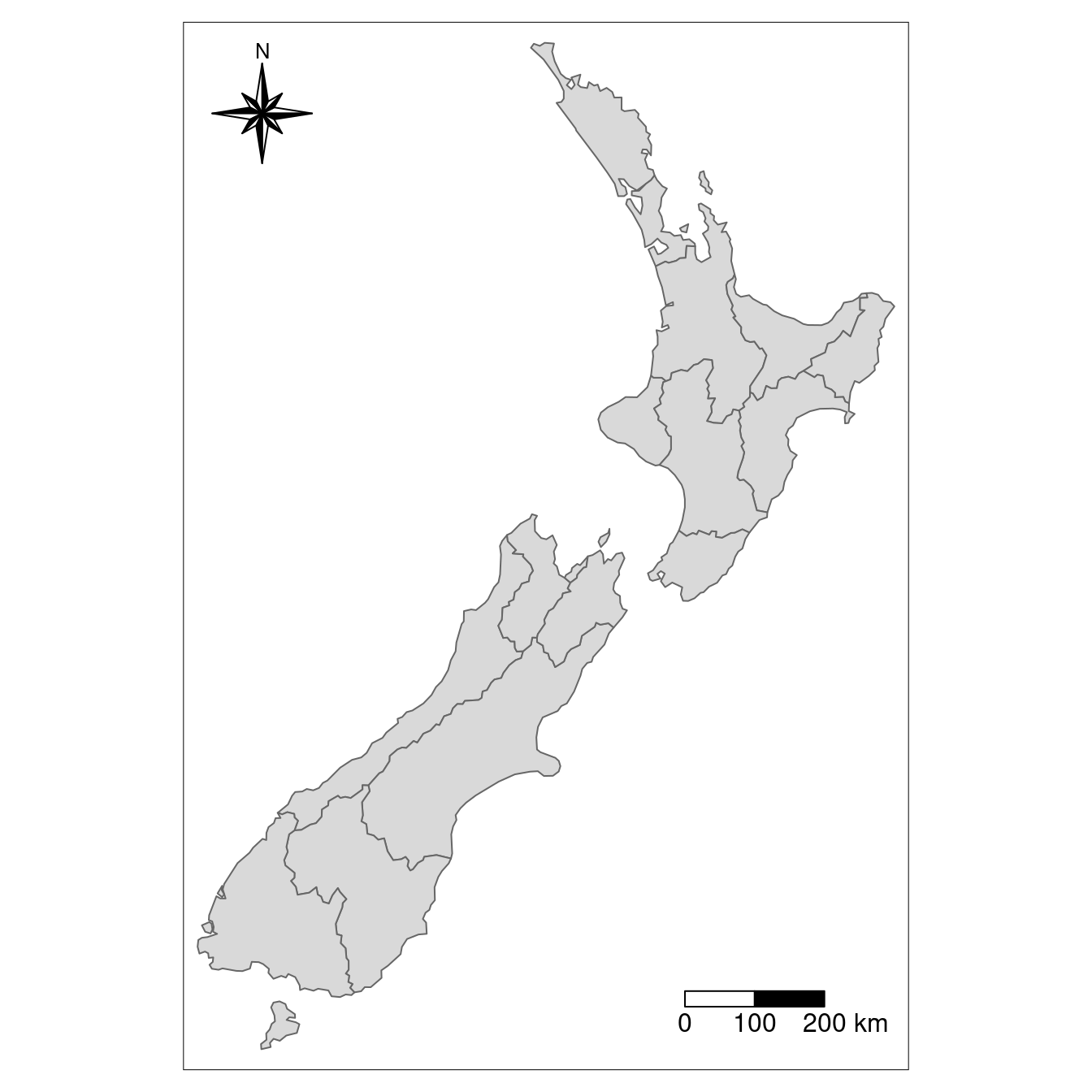
FIGURE 8.8: Map with additional elements - a north arrow and scale bar.
tmap also allows a wide variety of layout settings to be changed, some of which, produced using the following code (see args(tm_layout) or ?tm_layout for a full list), are illustrated in Figure 8.9:
map_nz + tm_layout(title = "New Zealand")
map_nz + tm_layout(scale = 5)
map_nz + tm_layout(bg.color = "lightblue")
map_nz + tm_layout(frame = FALSE)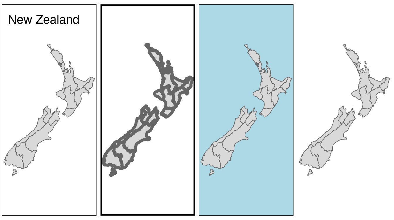
FIGURE 8.9: Layout options specified by (from left to right) title, scale, bg.color and frame arguments.
The other arguments in tm_layout() provide control over many more aspects of the map in relation to the canvas on which it is placed.
Here are some useful layout settings (some of which are illustrated in Figure 8.10):
- Frame width (
frame.lwd) and an option to allow double lines (frame.double.line) - Margin settings including
outer.marginandinner.margin - Font settings controlled by
fontfaceandfontfamily - Legend settings including binary options such as
legend.show(whether or not to show the legend)legend.only(omit the map) andlegend.outside(should the legend go outside the map?), as well as multiple choice settings such aslegend.position - Default colors of aesthetic layers (
aes.color), map attributes such as the frame (attr.color) - Color settings controlling
sepia.intensity(how yellowy the map looks) andsaturation(a color-grayscale)
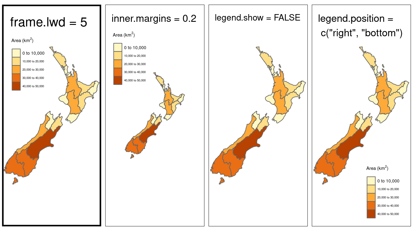
FIGURE 8.10: Illustration of selected layout options.
The impact of changing the color settings listed above is illustrated in Figure 8.11 (see ?tm_layout for a full list).
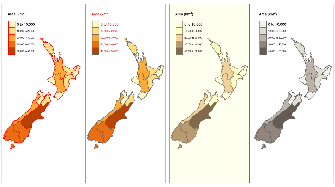
FIGURE 8.11: Illustration of selected color-related layout options.
Beyond the low-level control over layouts and colors, tmap also offers high-level styles, using the tm_style() function (representing the second meaning of ‘style’ in the package).
Some styles such as tm_style("cobalt") result in stylized maps, while others such as tm_style("gray") make more subtle changes, as illustrated in Figure 8.12, created using the code below (see 08-tmstyles.R):
map_nza + tm_style("bw")
map_nza + tm_style("classic")
map_nza + tm_style("cobalt")
map_nza + tm_style("col_blind")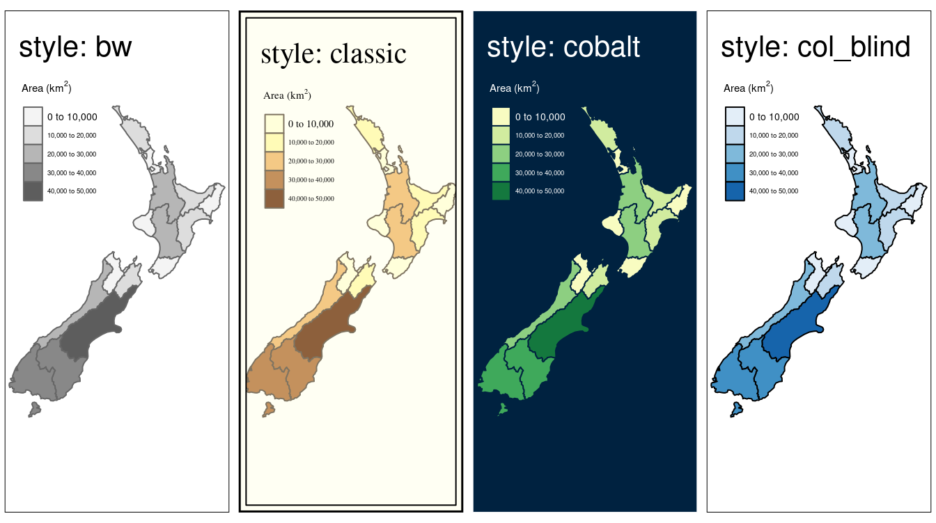
FIGURE 8.12: Selected tmap styles.
tmap_style_catalogue().
This creates a folder called tmap_style_previews containing nine images.
Each image, from tm_style_albatross.png to tm_style_white.png, shows a faceted map of the world in the corresponding style.
Note: tmap_style_catalogue() takes some time to run.
8.2.6 Faceted maps
Faceted maps, also referred to as ‘small multiples,’ are composed of many maps arranged side-by-side, and sometimes stacked vertically (Meulemans et al. 2017). Facets enable the visualization of how spatial relationships change with respect to another variable, such as time. The changing populations of settlements, for example, can be represented in a faceted map with each panel representing the population at a particular moment in time. The time dimension could be represented via another aesthetic such as color. However, this risks cluttering the map because it will involve multiple overlapping points (cities do not tend to move over time!).
Typically all individual facets in a faceted map contain the same geometry data repeated multiple times, once for each column in the attribute data (this is the default plotting method for sf objects, see Chapter 2).
However, facets can also represent shifting geometries such as the evolution of a point pattern over time.
This use case of faceted plot is illustrated in Figure 8.13.
urb_1970_2030 = urban_agglomerations %>%
  filter(year %in% c(1970, 1990, 2010, 2030))

tm_shape(world) +
  tm_polygons() +
  tm_shape(urb_1970_2030) +
  tm_symbols(col = "black", border.col = "white", size = "population_millions") +
  tm_facets(by = "year", nrow = 2, free.coords = FALSE)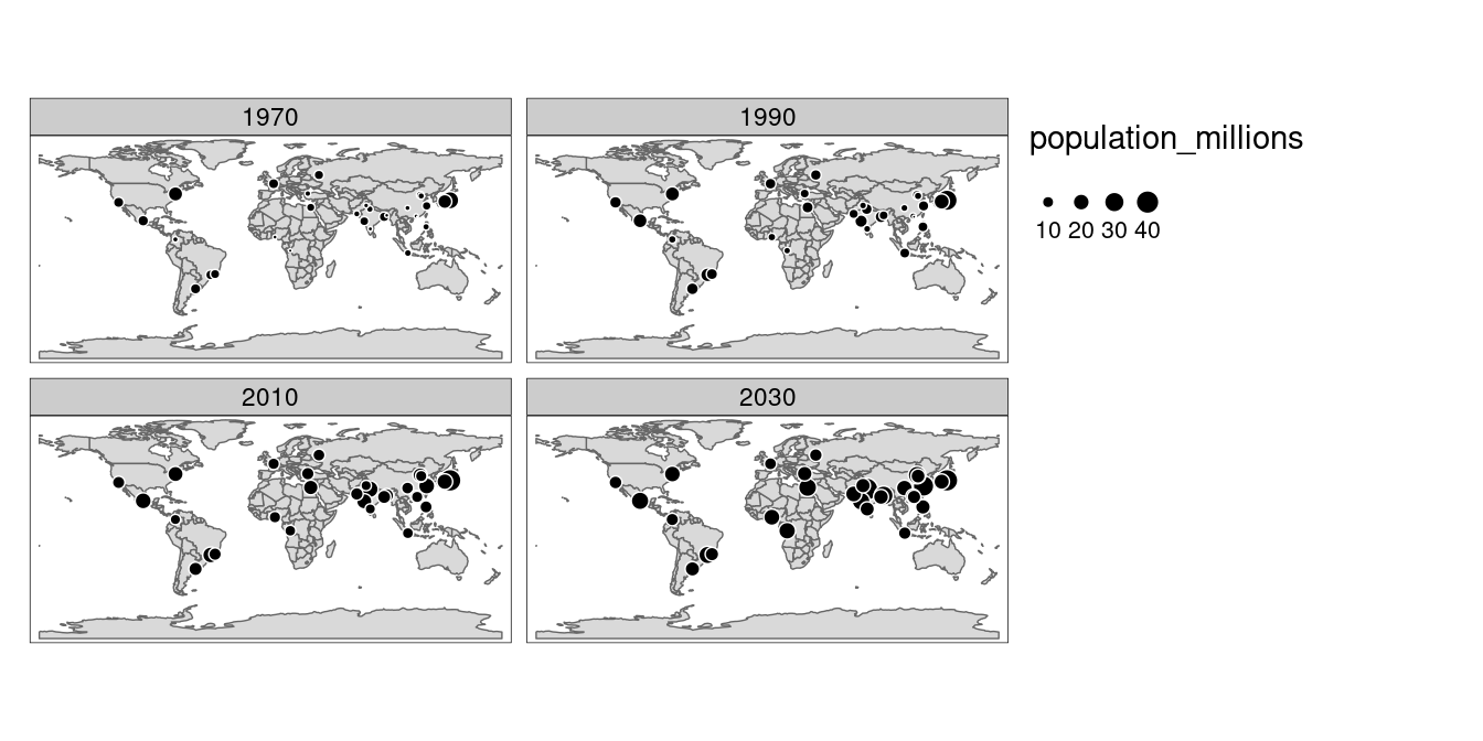
FIGURE 8.13: Faceted map showing the top 30 largest urban agglomerations from 1970 to 2030 based on population projections by the United Nations.
The preceding code chunk demonstrates key features of faceted maps created with tmap:
- Shapes that do not have a facet variable are repeated (the countries in
worldin this case) - The
byargument which varies depending on a variable (yearin this case). - The
nrow/ncolsetting specifying the number of rows and columns that facets should be arranged into - The
free.coordsparameter specifying if each map has its own bounding box
In addition to their utility for showing changing spatial relationships, faceted maps are also useful as the foundation for animated maps (see Section 8.3).
8.2.7 Inset maps
An inset map is a smaller map rendered within or next to the main map. It could serve many different purposes, including providing a context (Figure 8.14) or bringing some non-contiguous regions closer to ease their comparison (Figure 8.15). They could be also used to focus on a smaller area in more detail or to cover the same area as the map, but representing a different topic.
In the example below, we create a map of the central part of New Zealand’s Southern Alps.
Our inset map will show where the main map is in relation to the whole New Zealand.
The first step is to define the area of interest, which can be done by creating a new spatial object, nz_region.
nz_region = st_bbox(c(xmin = 1340000, xmax = 1450000,
                      ymin = 5130000, ymax = 5210000),
                    crs = st_crs(nz_height)) %>%
  st_as_sfc()
In the second step, we create a base map showing the New Zealand’s Southern Alps area. This is a place where the most important message is stated.
nz_height_map = tm_shape(nz_elev, bbox = nz_region) +
  tm_raster(style = "cont", palette = "YlGn", legend.show = TRUE) +
  tm_shape(nz_height) + tm_symbols(shape = 2, col = "red", size = 1) +
  tm_scale_bar(position = c("left", "bottom"))
The third step consists of the inset map creation. It gives a context and helps to locate the area of interest. Importantly, this map needs to clearly indicate the location of the main map, for example by stating its borders.
nz_map = tm_shape(nz) + tm_polygons() +
  tm_shape(nz_height) + tm_symbols(shape = 2, col = "red", size = 0.1) +
  tm_shape(nz_region) + tm_borders(lwd = 3)
Finally, we combine the two maps using the function viewport() from the grid package, the first arguments of which specify the center location (x and y) and a size (width and height) of the inset map.
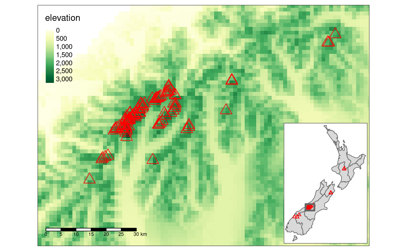
FIGURE 8.14: Inset map providing a context - location of the central part of the Southern Alps in New Zealand.
Inset map can be saved to file either by using a graphic device (see Section 7.8) or the tmap_save() function and its arguments - insets_tm and insets_vp.
Inset maps are also used to create one map of non-contiguous areas.
Probably, the most often used example is a map of the United States, which consists of the contiguous United States, Hawaii and Alaska.
It is very important to find the best projection for each individual inset in these types of cases (see Chapter 6 to learn more).
We can use US National Atlas Equal Area for the map of the contiguous United States by putting its EPSG code in the projection argument of tm_shape().
us_states_map = tm_shape(us_states, projection = 2163) + tm_polygons() +
  tm_layout(frame = FALSE)
The rest of our objects, hawaii and alaska, already have proper projections; therefore, we just need to create two separate maps:
hawaii_map = tm_shape(hawaii) + tm_polygons() +
  tm_layout(title = "Hawaii", frame = FALSE, bg.color = NA,
            title.position = c("LEFT", "BOTTOM"))
alaska_map = tm_shape(alaska) + tm_polygons() +
  tm_layout(title = "Alaska", frame = FALSE, bg.color = NA)
The final map is created by combining and arranging these three maps:
us_states_map
print(hawaii_map, vp = grid::viewport(0.35, 0.1, width = 0.2, height = 0.1))
print(alaska_map, vp = grid::viewport(0.15, 0.15, width = 0.3, height = 0.3))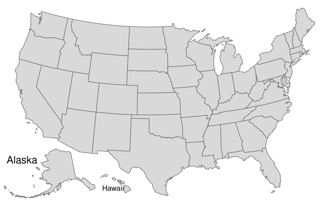
FIGURE 8.15: Map of the United States.
The code presented above is compact and can be used as the basis for other inset maps but the results, in Figure 8.15, provide a poor representation of the locations of Hawaii and Alaska.
For a more in-depth approach, see the us-map vignette from the geocompkg.
8.3 Animated maps
Faceted maps, described in Section 8.2.6, can show how spatial distributions of variables change (e.g., over time), but the approach has disadvantages. Facets become tiny when there are many of them. Furthermore, the fact that each facet is physically separated on the screen or page means that subtle differences between facets can be hard to detect.
Animated maps solve these issues. Although they depend on digital publication, this is becoming less of an issue as more and more content moves online. Animated maps can still enhance paper reports: you can always link readers to a web-page containing an animated (or interactive) version of a printed map to help make it come alive. There are several ways to generate animations in R, including with animation packages such as gganimate, which builds on ggplot2 (see Section 8.6). This section focusses on creating animated maps with tmap because its syntax will be familiar from previous sections and the flexibility of the approach.
Figure 8.16 is a simple example of an animated map. Unlike the faceted plot, it does not squeeze multiple maps into a single screen and allows the reader to see how the spatial distribution of the world’s most populous agglomerations evolve over time (see the book’s website for the animated version).
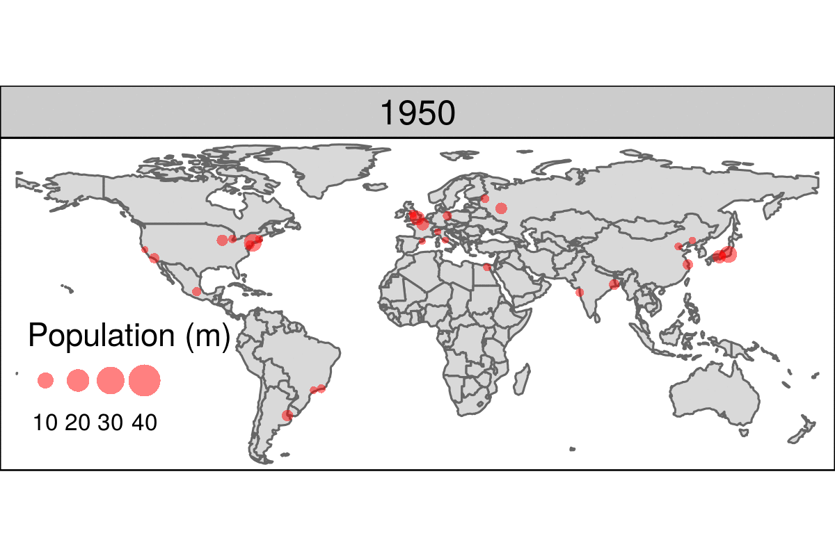
FIGURE 8.16: Animated map showing the top 30 largest urban agglomerations from 1950 to 2030 based on population projects by the United Nations. Animated version available online at: geocompr.robinlovelace.net.
The animated map illustrated in Figure 8.16 can be created using the same tmap techniques that generate faceted maps, demonstrated in Section 8.2.6.
There are two differences, however, related to arguments in tm_facets():
-
along = "year"is used instead ofby = "year". -
free.coords = FALSE, which maintains the map extent for each map iteration.
These additional arguments are demonstrated in the subsequent code chunk:
urb_anim = tm_shape(world) + tm_polygons() +
  tm_shape(urban_agglomerations) + tm_dots(size = "population_millions") +
  tm_facets(along = "year", free.coords = FALSE)
The resulting urb_anim represents a set of separate maps for each year.
The final stage is to combine them and save the result as a .gif file with tmap_animation().
The following command creates the animation illustrated in Figure 8.16, with a few elements missing, that we will add in during the exercises:
tmap_animation(urb_anim, filename = "urb_anim.gif", delay = 25)Another illustration of the power of animated maps is provided in Figure 8.17.
This shows the development of states in the United States, which first formed in the east and then incrementally to the west and finally into the interior.
Code to reproduce this map can be found in the script 08-usboundaries.R.
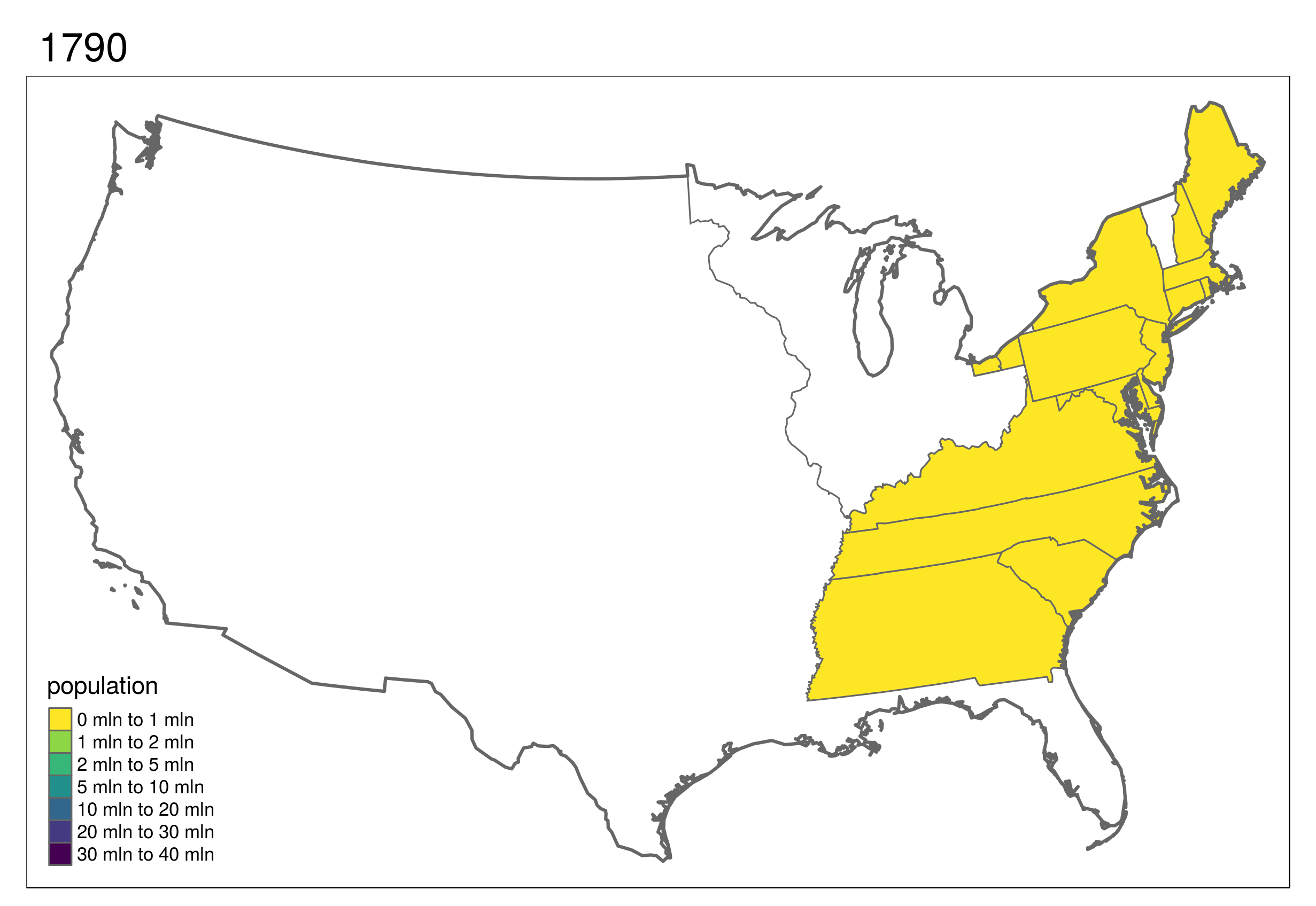
FIGURE 8.17: Animated map showing population growth, state formation and boundary changes in the United States, 1790-2010. Animated version available online at geocompr.robinlovelace.net.
8.4 Interactive maps
While static and animated maps can enliven geographic datasets, interactive maps can take them to a new level. Interactivity can take many forms, the most common and useful of which is the ability to pan around and zoom into any part of a geographic dataset overlaid on a ‘web map’ to show context. Less advanced interactivity levels include popups which appear when you click on different features, a kind of interactive label. More advanced levels of interactivity include the ability to tilt and rotate maps, as demonstrated in the mapdeck example below, and the provision of “dynamically linked” sub-plots which automatically update when the user pans and zooms (Pezanowski et al. 2018).
The most important type of interactivity, however, is the display of geographic data on interactive or ‘slippy’ web maps. The release of the leaflet package in 2015 revolutionized interactive web map creation from within R and a number of packages have built on these foundations adding new features (e.g., leaflet.extras) and making the creation of web maps as simple as creating static maps (e.g., mapview and tmap). This section illustrates each approach in the opposite order. We will explore how to make slippy maps with tmap (the syntax of which we have already learned), mapview and finally leaflet (which provides low-level control over interactive maps).
A unique feature of tmap mentioned in Section 8.2 is its ability to create static and interactive maps using the same code.
Maps can be viewed interactively at any point by switching to view mode, using the command tmap_mode("view").
This is demonstrated in the code below, which creates an interactive map of New Zealand based on the tmap object map_nz, created in Section 8.2.2, and illustrated in Figure 8.18:
tmap_mode("view")
map_nz
FIGURE 8.18: Interactive map of New Zealand created with tmap in view mode. Interactive version available online at: geocompr.robinlovelace.net.
Now that the interactive mode has been ‘turned on,’ all maps produced with tmap will launch (another way to create interactive maps is with the tmap_leaflet function).
Notable features of this interactive mode include the ability to specify the basemap with tm_basemap() (or tmap_options()) as demonstrated below (result not shown):
map_nz + tm_basemap(server = "OpenTopoMap")An impressive and little-known feature of tmap’s view mode is that it also works with faceted plots.
The argument sync in tm_facets() can be used in this case to produce multiple maps with synchronized zoom and pan settings, as illustrated in Figure 8.19, which was produced by the following code:
world_coffee = left_join(world, coffee_data, by = "name_long")
facets = c("coffee_production_2016", "coffee_production_2017")
tm_shape(world_coffee) + tm_polygons(facets) +
  tm_facets(nrow = 1, sync = TRUE)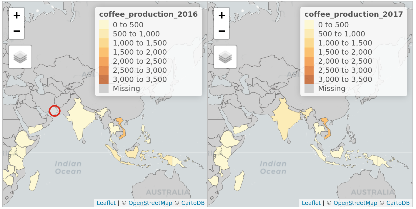
FIGURE 8.19: Faceted interactive maps of global coffee production in 2016 and 2017 in sync, demonstrating tmap’s view mode in action.
Switch tmap back to plotting mode with the same function:
tmap_mode("plot")
#> tmap mode set to plotting
If you are not proficient with tmap, the quickest way to create interactive maps may be with mapview. The following ‘one liner’ is a reliable way to interactively explore a wide range of geographic data formats:
mapview::mapview(nz)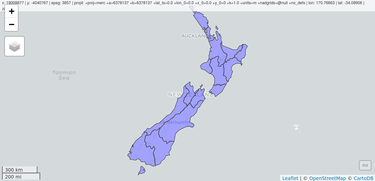
FIGURE 8.20: Illustration of mapview in action.
mapview has a concise syntax yet is powerful. By default, it provides some standard GIS functionality such as mouse position information, attribute queries (via pop-ups), scale bar, and zoom-to-layer buttons.
It offers advanced controls including the ability to ‘burst’ datasets into multiple layers and the addition of multiple layers with + followed by the name of a geographic object.
Additionally, it provides automatic coloring of attributes (via argument zcol).
In essence, it can be considered a data-driven leaflet API (see below for more information about leaflet).
Given that mapview always expects a spatial object (sf, Spatial*, Raster*) as its first argument, it works well at the end of piped expressions.
Consider the following example where sf is used to intersect lines and polygons and then is visualized with mapview (Figure 8.21).
trails %>%
  st_transform(st_crs(franconia)) %>%
  st_intersection(franconia[franconia$district == "Oberfranken", ]) %>%
  st_collection_extract("LINE") %>%
  mapview(color = "red", lwd = 3, layer.name = "trails") +
  mapview(franconia, zcol = "district", burst = TRUE) +
  breweries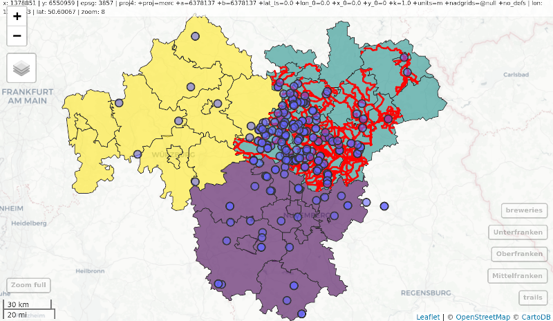
FIGURE 8.21: Using mapview at the end of a sf-based pipe expression.
One important thing to keep in mind is that mapview layers are added via the + operator (similar to ggplot2 or tmap). This is a frequent gotcha in piped workflows where the main binding operator is %>%.
For further information on mapview, see the package’s website at: r-spatial.github.io/mapview/.
There are other ways to create interactive maps with R.
The googleway package, for example, provides an interactive mapping interface that is flexible and extensible
(see the googleway-vignette for details).
Another approach by the same author is mapdeck, which provides access to Uber’s Deck.gl framework.
Its use of WebGL enables it to interactively visualize large datasets (up to millions of points).
The package uses Mapbox access tokens, which you must register for before using the package.
MAPBOX=your_unique_key.
This can be added with edit_r_environ() from the usethis package.
A unique feature of mapdeck is its provision of interactive ‘2.5d’ perspectives, illustrated in Figure 8.22. This means you can can pan, zoom and rotate around the maps, and view the data ‘extruded’ from the map. Figure 8.22, generated by the following code chunk, visualizes road traffic crashes in the UK, with bar height respresenting casualties per area.
library(mapdeck)
set_token(Sys.getenv("MAPBOX"))
crash_data = read.csv("https://git.io/geocompr-mapdeck")
crash_data = na.omit(crash_data)
ms = mapdeck_style("dark")
mapdeck(style = ms, pitch = 45, location = c(0, 52), zoom = 4) %>%
add_grid(data = crash_data, lat = "lat", lon = "lng", cell_size = 1000,
         elevation_scale = 50, layer_id = "grid_layer",
         colour_range = viridisLite::plasma(6))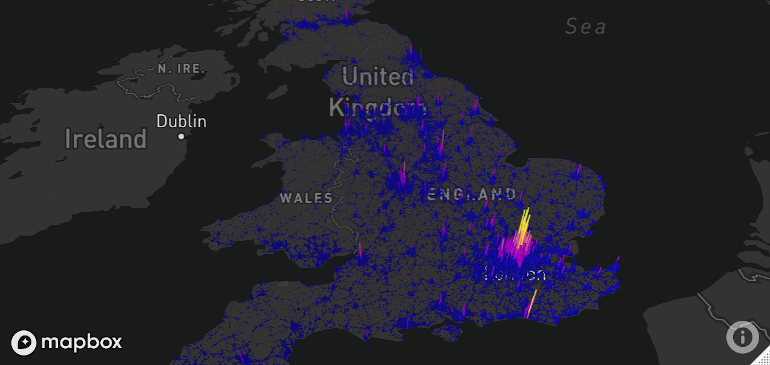
FIGURE 8.22: Map generated by mapdeck, representing road traffic casualties across the UK. Height of 1 km cells represents number of crashes.
In the browser you can zoom and drag, in addition to rotating and tilting the map when pressing Cmd/Ctrl.
Multiple layers can be added with the %>% operator, as demonstrated in the mapdeck vignette.
Mapdeck also supports sf objects, as can be seen by replacing the add_grid() function call in the preceding code chunk with add_polygon(data = lnd, layer_id = "polygon_layer"), to add polygons representing London to an interactive tilted map.
Last but not least is leaflet which is the most mature and widely used interactive mapping package in R. leaflet provides a relatively low-level interface to the Leaflet JavaScript library and many of its arguments can be understood by reading the documentation of the original JavaScript library (see leafletjs.com).
Leaflet maps are created with leaflet(), the result of which is a leaflet map object which can be piped to other leaflet functions.
This allows multiple map layers and control settings to be added interactively, as demonstrated in the code below which generates Figure 8.23 (see rstudio.github.io/leaflet/ for details).
pal = colorNumeric("RdYlBu", domain = cycle_hire$nbikes)
leaflet(data = cycle_hire) %>%
  addProviderTiles(providers$CartoDB.Positron) %>%
  addCircles(col = ~pal(nbikes), opacity = 0.9) %>%
  addPolygons(data = lnd, fill = FALSE) %>%
  addLegend(pal = pal, values = ~nbikes) %>%
  setView(lng = -0.1, 51.5, zoom = 12) %>%
addMiniMap().](figures/leaflet-1.png)
FIGURE 8.23: The leaflet package in action, showing cycle hire points in London. See interactive version online.
8.5 Mapping applications
The interactive web maps demonstrated in Section 8.4 can go far. Careful selection of layers to display, base-maps and pop-ups can be used to communicate the main results of many projects involving geocomputation. But the web mapping approach to interactivity has limitations:
- Although the map is interactive in terms of panning, zooming and clicking, the code is static, meaning the user interface is fixed
- All map content is generally static in a web map, meaning that web maps cannot scale to handle large datasets easily
- Additional layers of interactivity, such a graphs showing relationships between variables and ‘dashboards’ are difficult to create using the web-mapping approach
Overcoming these limitations involves going beyond static web mapping and towards geospatial frameworks and map servers. Products in this field include GeoDjango (which extends the Django web framework and is written in Python), MapGuide (a framework for developing web applications, largely written in C++) and GeoServer (a mature and powerful map server written in Java). Each of these (particularly GeoServer) is scalable, enabling maps to be served to thousands of people daily — assuming there is sufficient public interest in your maps! The bad news is that such server-side solutions require much skilled developer time to set-up and maintain, often involving teams of people with roles such as a dedicated geospatial database administrator (DBA).
The good news is that web mapping applications can now be rapidly created using shiny, a package for converting R code into interactive web applications.
This is thanks to its support for interactive maps via functions such as renderLeaflet(), documented on the Shiny integration section of RStudio’s leaflet website.
This section gives some context, teaches the basics of shiny from a web mapping perspective and culminates in a full-screen mapping application in less than 100 lines of code.
The way shiny works is well documented at shiny.rstudio.com.
The two key elements of a shiny app reflect the duality common to most web application development: ‘front end’ (the bit the user sees) and ‘back end’ code.
In shiny apps, these elements are typically created in objects named ui and server within an R script named app.R, which lives in an ‘app folder.’
This allows web mapping applications to be represented in a single file, such as the coffeeApp/app.R file in the book’s GitHub repo.
ui.R (short for user interface) and server.R files, naming conventions used by shiny-server, a server-side Linux application for serving shiny apps on public-facing websites.
shiny-server also serves apps defined by a single app.R file in an ‘app folder.’
Learn more at: https://github.com/rstudio/shiny-server.
Before considering large apps, it is worth seeing a minimal example, named ‘lifeApp,’ in action.44
The code below defines and launches — with the command shinyApp() — a lifeApp, which provides an interactive slider allowing users to make countries appear with progressively lower levels of life expectancy (see Figure 8.24):
library(shiny)    # for shiny apps
library(leaflet)  # renderLeaflet function
library(spData)   # loads the world dataset
ui = fluidPage(
  sliderInput(inputId = "life", "Life expectancy", 49, 84, value = 80),
      leafletOutput(outputId = "map")
  )
server = function(input, output) {
  output$map = renderLeaflet({
    leaflet() %>%
      # addProviderTiles("OpenStreetMap.BlackAndWhite") %>%
      addPolygons(data = world[world$lifeExp < input$life, ])})
}
shinyApp(ui, server)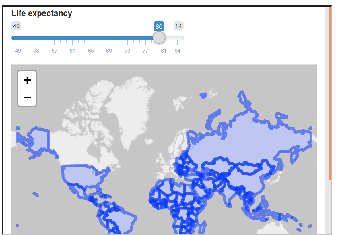
FIGURE 8.24: Screenshot showing minimal example of a web mapping application created with shiny.
The user interface (ui) of lifeApp is created by fluidPage().
This contains input and output ‘widgets’ — in this case, a sliderInput() (many other *Input() functions are available) and a leafletOutput().
These are arranged row-wise by default, explaining why the slider interface is placed directly above the map in Figure 8.24 (see ?column for adding content column-wise).
The server side (server) is a function with input and output arguments.
output is a list of objects containing elements generated by render*() function — renderLeaflet() which in this example generates output$map.
Input elements such as input$life referred to in the server must relate to elements that exist in the ui — defined by inputId = "life" in the code above.
The function shinyApp() combines both the ui and server elements and serves the results interactively via a new R process.
When you move the slider in the map shown in Figure 8.24, you are actually causing R code to re-run, although this is hidden from view in the user interface.
Building on this basic example and knowing where to find help (see ?shiny), the best way forward now may be to stop reading and start programming!
The recommended next step is to open the previously mentioned CycleHireApp/app.R script in an IDE of choice, modify it and re-run it repeatedly.
The example contains some of the components of a web mapping application implemented in shiny and should ‘shine’ a light on how they behave.
The CycleHireApp/app.R script contains shiny functions that go beyond those demonstrated in the simple ‘lifeApp’ example.
These include reactive() and observe() (for creating outputs that respond to the user interface — see ?reactive) and leafletProxy() (for modifying a leaflet object that has already been created).
Such elements are critical to the creation of web mapping applications implemented in shiny.
A range of ‘events’ can be programmed including advanced functionality such as drawing new layers or subsetting data, as described in the shiny section of RStudio’s leaflet website.
app.R, ui.R or server.R script is open.
shiny apps can also be initiated by using runApp() with the first argument being the folder containing the app code and data: runApp("CycleHireApp") in this case (which assumes a folder named CycleHireApp containing the app.R script is in your working directory).
You can also launch apps from a Unix command line with the command Rscript -e 'shiny::runApp("CycleHireApp")'.
Experimenting with apps such as CycleHireApp will build not only your knowledge of web mapping applications in R, but also your practical skills.
Changing the contents of setView(), for example, will change the starting bounding box that the user sees when the app is initiated.
Such experimentation should not be done at random, but with reference to relevant documentation, starting with ?shiny, and motivated by a desire to solve problems such as those posed in the exercises.
shiny used in this way can make prototyping mapping applications faster and more accessible than ever before (deploying shiny apps is a separate topic beyond the scope of this chapter). Even if your applications are eventually deployed using different technologies, shiny undoubtedly allows web mapping applications to be developed in relatively few lines of code (76 in the case of CycleHireApp). That does not stop shiny apps getting rather large. The Propensity to Cycle Tool (PCT) hosted at pct.bike, for example, is a national mapping tool funded by the UK’s Department for Transport. The PCT is used by dozens of people each day and has multiple interactive elements based on more than 1000 lines of code (Lovelace et al. 2017).
While such apps undoubtedly take time and effort to develop, shiny provides a framework for reproducible prototyping that should aid the development process. One potential problem with the ease of developing prototypes with shiny is the temptation to start programming too early, before the purpose of the mapping application has been envisioned in detail. For that reason, despite advocating shiny, we recommend starting with the longer established technology of a pen and paper as the first stage for interactive mapping projects. This way your prototype web applications should be limited not by technical considerations, but by your motivations and imagination.
FIGURE 8.25: Hire a cycle App, a simple web mapping application for finding the closest cycle hiring station based on your location and requirement of cycles. Interactive version available online at geocompr.robinlovelace.net.
8.6 Other mapping packages
tmap provides a powerful interface for creating a wide range of static maps (Section 8.2) and also supports interactive maps (Section 8.4). But there are many other options for creating maps in R. The aim of this section is to provide a taster of some of these and pointers for additional resources: map making is a surprisingly active area of R package development, so there is more to learn than can be covered here.
The most mature option is to use plot() methods provided by core spatial packages sf and raster, covered in Sections 2.2.3 and 2.3.3, respectively.
What we have not mentioned in those sections was that plot methods for raster and vector objects can be combined when the results draw onto the same plot area (elements such as keys in sf plots and multi-band rasters will interfere with this).
This behavior is illustrated in the subsequent code chunk which generates Figure 8.26.
plot() has many other options which can be explored by following links in the ?plot help page and the sf vignette sf5.
g = st_graticule(nz, lon = c(170, 175), lat = c(-45, -40, -35))
plot(nz_water, graticule = g, axes = TRUE, col = "blue")
raster::plot(nz_elev / 1000, add = TRUE)
plot(st_geometry(nz), add = TRUE)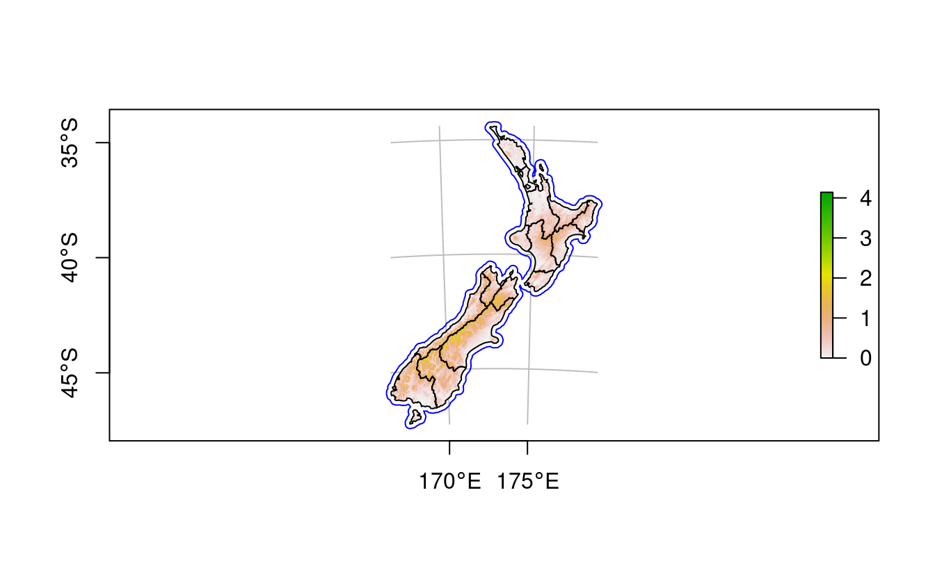
FIGURE 8.26: Map of New Zealand created with plot(). The legend to the right refers to elevation (1000 m above sea level).
Since version 2.3.0, the tidyverse plotting package ggplot2 has supported sf objects with geom_sf().
The syntax is similar to that used by tmap:
an initial ggplot() call is followed by one or more layers, that are added with + geom_*(), where * represents a layer type such as geom_sf() (for sf objects) or geom_points() (for points).
ggplot2 plots graticules by default.
The default settings for the graticules can be overridden using scale_x_continuous(), scale_y_continuous() or coord_sf(datum = NA).
Other notable features include the use of unquoted variable names encapsulated in aes() to indicate which aesthetics vary and switching data sources using the data argument, as demonstrated in the code chunk below which creates Figure 8.27:
library(ggplot2)
g1 = ggplot() + geom_sf(data = nz, aes(fill = Median_income)) +
  geom_sf(data = nz_height) +
  scale_x_continuous(breaks = c(170, 175))
g1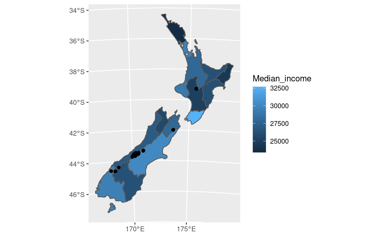
FIGURE 8.27: Map of New Zealand created with ggplot2.
An advantage of ggplot2 is that it has a strong user-community and many add-on packages. Good additional resources can be found in the open source ggplot2 book (Wickham 2016) and in the descriptions of the multitude of ‘ggpackages’ such as ggrepel and tidygraph.
Another benefit of maps based on ggplot2 is that they can easily be given a level of interactivity when printed using the function ggplotly() from the plotly package.
Try plotly::ggplotly(g1), for example, and compare the result with other plotly mapping functions described at: blog.cpsievert.me.
At the same time, ggplot2 has a few drawbacks.
The geom_sf() function is not always able to create a desired legend to use from the spatial data.
Raster objects are also not natively supported in ggplot2 and need to be converted into a data frame before plotting.
We have covered mapping with sf, raster and ggplot2 packages first because these packages are highly flexible, allowing for the creation of a wide range of static maps. Before we cover mapping packages for plotting a specific type of map (in the next paragraph), it is worth considering alternatives to the packages already covered for general-purpose mapping (Table 8.1).
| Package | Title |
|---|---|
| cartography | Thematic Cartography |
| ggplot2 | Create Elegant Data Visualisations Using the Grammar of Graphics |
| googleway | Accesses Google Maps APIs to Retrieve Data and Plot Maps |
| ggspatial | Spatial Data Framework for ggplot2 |
| leaflet | Create Interactive Web Maps with Leaflet |
| mapview | Interactive Viewing of Spatial Data in R |
| plotly | Create Interactive Web Graphics via ‘plotly.js’ |
| rasterVis | Visualization Methods for Raster Data |
| tmap | Thematic Maps |
Table 8.1 shows a range of mapping packages are available, and there are many others not listed in this table.
Of note is cartography, which generates a range of unusual maps including choropleth, ‘proportional symbol’ and ‘flow’ maps, each of which is documented in the vignette cartography.
Several packages focus on specific map types, as illustrated in Table 8.2. Such packages create cartograms that distort geographical space, create line maps, transform polygons into regular or hexagonal grids, and visualize complex data on grids representing geographic topologies.
| Package | Title |
|---|---|
| cartogram | Create Cartograms with R |
| geogrid | Turn Geospatial Polygons into Regular or Hexagonal Grids |
| geofacet | ‘ggplot2’ Faceting Utilities for Geographical Data |
| globe | Plot 2D and 3D Views of the Earth, Including Major Coastline |
| linemap | Line Maps |
All of the aforementioned packages, however, have different approaches for data preparation and map creation. In the next paragraph, we focus solely on the cartogram package. Therefore, we suggest to read the linemap, geogrid and geofacet documentations to learn more about them.
A cartogram is a map in which the geometry is proportionately distorted to represent a mapping variable. Creation of this type of map is possible in R with cartogram, which allows for creating continuous and non-contiguous area cartograms. It is not a mapping package per se, but it allows for construction of distorted spatial objects that could be plotted using any generic mapping package.
The cartogram_cont() function creates continuous area cartograms.
It accepts an sf object and name of the variable (column) as inputs.
Additionally, it is possible to modify the intermax argument - maximum number of iterations for the cartogram transformation.
For example, we could represent median income in New Zeleand’s regions as a continuous cartogram (the right-hand panel of Figure 8.28) as follows:
library(cartogram)
nz_carto = cartogram_cont(nz, "Median_income", itermax = 5)
tm_shape(nz_carto) + tm_polygons("Median_income")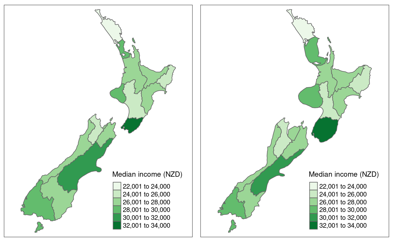
FIGURE 8.28: Comparison of standard map (left) and continuous area cartogram (right).
cartogram also offers creation of non-contiguous area cartograms using cartogram_ncont() and Dorling cartograms using cartogram_dorling().
Non-contiguous area cartograms are created by scaling down each region based on the provided weighting variable.
Dorling cartograms consist of circles with their area proportional to the weighting variable.
The code chunk below demonstrates creation of non-contiguous area and Dorling cartograms of US states’ population (Figure 8.29):
us_states2163 = st_transform(us_states, 2163)
us_states2163_ncont = cartogram_ncont(us_states2163, "total_pop_15")
us_states2163_dorling = cartogram_dorling(us_states2163, "total_pop_15")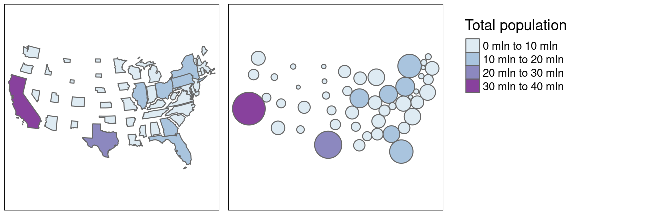
FIGURE 8.29: Comparison of non-continuous area cartogram (left) and Dorling cartogram (right).
New mapping packages are emerging all the time.
In 2018 alone, a number of mapping packages have been released on CRAN, including mapdeck, mapsapi, and rayshader.
In terms of interactive mapping, leaflet.extras contains many functions for extending the functionality of leaflet (see the end of the point-pattern vignette in the geocompkg website for examples of heatmaps created by leaflet.extras).
8.7 Exercises
These exercises rely on a new object, africa.
Create it using the world and worldbank_df datasets from the spData package as follows (see Chapter 3):
africa = world %>%
  filter(continent == "Africa", !is.na(iso_a2)) %>%
  left_join(worldbank_df, by = "iso_a2") %>%
  dplyr::select(name, subregion, gdpPercap, HDI, pop_growth) %>%
  st_transform("+proj=aea +lat_1=20 +lat_2=-23 +lat_0=0 +lon_0=25")
We will also use zion and nlcd datasets from spDataLarge:
zion = st_read((system.file("vector/zion.gpkg", package = "spDataLarge")))
data(nlcd, package = "spDataLarge")- Create a map showing the geographic distribution of the Human Development Index (
HDI) across Africa with base graphics (hint: useplot()) and tmap packages (hint: usetm_shape(africa) + ...).- Name two advantages of each based on the experience.
- Name three other mapping packages and an advantage of each.
- Bonus: create three more maps of Africa using these three packages.
- Extend the tmap created for the previous exercise so the legend has three bins: “High” (
HDIabove 0.7), “Medium” (HDIbetween 0.55 and 0.7) and “Low” (HDIbelow 0.55).- Bonus: improve the map aesthetics, for example by changing the legend title, class labels and color palette.
- Represent
africa’s subregions on the map. Change the default color palette and legend title. Next, combine this map and the map created in the previous exercise into a single plot. - Create a land cover map of the Zion National Park.
- Change the default colors to match your perception of the land cover categories
- Add a scale bar and north arrow and change the position of both to improve the map’s aesthetic appeal
- Bonus: Add an inset map of Zion National Park’s location in the context of the Utah state. (Hint: an object representing Utah can be subset from the
us_statesdataset.)
- Create facet maps of countries in Eastern Africa:
- With one facet showing HDI and the other representing population growth (hint: using variables
HDIandpop_growth, respectively) - With a ‘small multiple’ per country
- With one facet showing HDI and the other representing population growth (hint: using variables
- Building on the previous facet map examples, create animated maps of East Africa:
- Showing first the spatial distribution of HDI scores then population growth
- Showing each country in order
- Create an interactive map of Africa:
- With tmap
- With mapview
- With leaflet
- Bonus: For each approach, add a legend (if not automatically provided) and a scale bar
- Sketch on paper ideas for a web mapping app that could be used to make transport or land-use policies more evidence based:
- In the city you live, for a couple of users per day
- In the country you live, for dozens of users per day
- Worldwide for hundreds of users per day and large data serving requirements
- Update the code in
coffeeApp/app.Rso that instead of centering on Brazil the user can select which country to focus on:- Using
textInput() - Using
selectInput()
- Using
- Reproduce Figure 8.1 and the 1st and 6th panel of Figure 8.6 as closely as possible using the ggplot2 package.
- Join
us_statesandus_states_dftogether and calculate a poverty rate for each state using the new dataset. Next, construct a continuous area cartogram based on total population. Finally, create and compare two maps of the poverty rate: (1) a standard choropleth map and (2) a map using the created cartogram boundaries. What is the information provided by the first and the second map? How do they differ from each other? - Visualize population growth in Africa. Next, compare it with the maps of a hexagonal and regular grid created using the geogrid package.